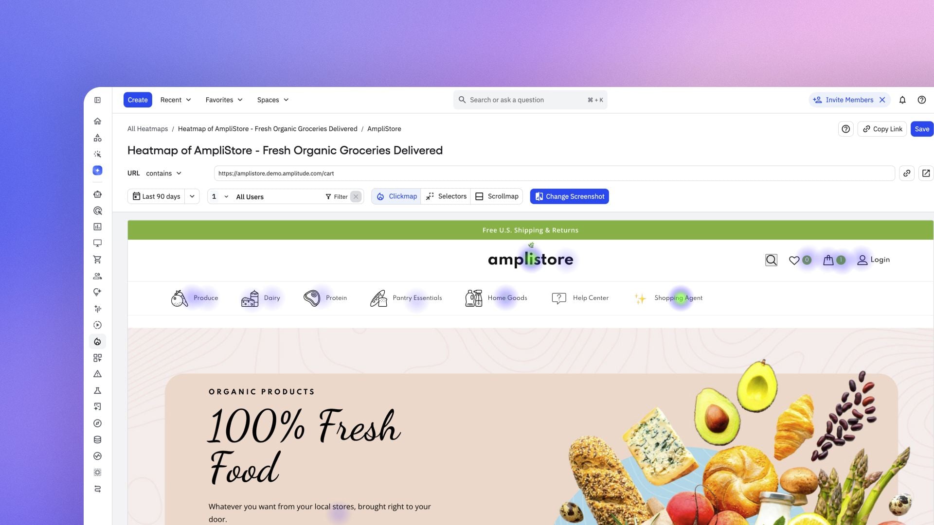
When a platform as foundational as Amplitude refreshes a core feature, I pay close attention. Heatmaps are where qualitative intuition meets quantitative scale, and reliability and precision determine whether teams trust what they see. The latest update meaningfully raises the bar for product analytics teams who depend on crisp visual evidence to guide experiments, diagnose friction, and accelerate product-led growth.
Here’s the essence of the change, in Amplitude’s own terms: “more reliable screenshot capture, selector-based placement, automatic device detection, and a redesigned scrollmap.” That combination tackles the two biggest historical pain points with heatmaps—stability in dynamic interfaces and confidence that clicks are attributed to the right UI elements across devices and layouts.
First, more reliable screenshot capture improves the fidelity of what I’m analyzing. When screenshots consistently mirror the live UI state, I can compare sessions across releases without worrying about rendering quirks or timing artifacts. That boosts trust in behavioral analytics, shortens feedback loops with engineering, and makes heatmaps a dependable companion to A/B testing and session replay.
Second, selector-based placement is a pragmatic step toward precision. In modern, componentized front ends where elements shift with personalization, localization, or responsive design, stable selectors dramatically reduce misattributed interactions. In practice, this means cleaner insights for funnel drop-off analysis, clearer readouts for micro-conversions (e.g., CTA vs. secondary actions), and more confident iteration on UX copy and layout—without constant re-instrumentation.
Third, automatic device detection aligns insights with the actual context of use. Patterns on mobile often diverge from desktop, and blending them can mask critical signals. Accurate device-specific readouts help me tailor experiments, refine activation paths, and decide when to prioritize mobile-first optimizations versus desktop refinements.
Finally, the redesigned scrollmap matters because attention is a finite resource. Knowing how far users scroll—and where they pause—helps me position value propositions, trust elements, and calls to action where they’ll be seen. Combining scroll insights with session replay and event data gives me a sharper picture of what’s above the fold, what’s ignored, and where copy or layout needs a rethink.
How I’d operationalize this update: validate key selectors with engineering and design for critical templates; compare pre- and post-update heatmaps to establish new baselines; segment by device to isolate diverging behaviors; map scroll depth to conversion micro-moments; and feed prioritized findings into backlog grooming and product roadmapping. This keeps heatmaps directly connected to outcomes rather than just interesting visuals.
Bottom line: these improvements make heatmaps a more trustworthy lens for discovery and optimization. With sturdier screenshot capture, precise selector-based placement, automatic device detection, and a redesigned scrollmap, I can move faster from observation to decision—reducing analysis ambiguity, tightening experiment cycles, and turning behavioral analytics into measurable product strategy.
Inspired by this post on Amplitude – Best Practices.


Leave a Reply