I’ve learned that the fastest way to earn user trust is to guide people to value within minutes, not weeks. As a VP of Product Management, I treat product tours as a strategic asset for product-led growth—not a band-aid for unclear UX. When we get them right, new users reach that first “aha” moment quickly, power users discover deeper capability, and support tickets quietly decline.
Learn how to create effective product tours that improve onboarding, feature adoption, and the user experience without overwhelming users.
My starting point is simple: every tour must serve a single job-to-be-done. I resist the urge to teach everything. Instead, I define one outcome (for example, sending a first campaign or inviting a teammate) and design a clear, three-to-five step flow. Strong UX writing does most of the heavy lifting—short, actionable language, consistent labels with the UI, and thoughtful tooltip design that highlights only what’s essential.
I rely on a small toolkit of in-app guides that meet users where they are. A concise welcome modal sets expectations and reiterates the value proposition. A checklist breaks the outcome into bite-sized wins. Hotspots and tooltips provide contextual nudges at the exact moment of need. Empty states teach by doing, showing an example and prompting the next action. Together, these patterns turn guidance into momentum without piling on cognitive load.
Personalization is non-negotiable. I segment tours by role, plan, and intent signal. New admins shouldn’t see the same flow as experienced creators. I trigger guides contextually—after users click into a feature, not on login—and I let them skip, snooze, or revisit the tour from a help menu. Respecting autonomy builds trust and keeps engagement high.
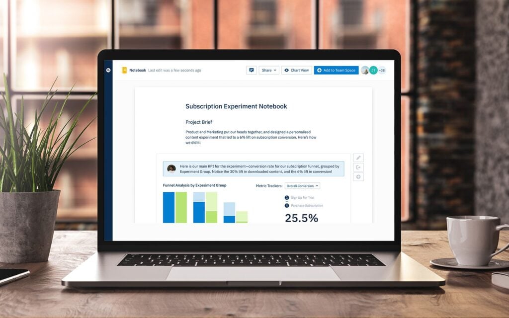
Measurement guides every decision. Before launch, I define success metrics like activation rate, time-to-value, and feature adoption. I instrument funnels with Amplitude analytics to track completion, drop-off by step, and follow-on behaviors (did they invite a teammate or create a second project?). I pair this with retention analysis to see whether guided users come back and expand usage. Then I A/B test copy, step order, and trigger timing until the data—and user feedback—tell a consistent story.
Operationally, I put a product trio—PM, design, and engineering—in charge of the tour experiments and integrate them into product roadmapping and sprint planning. We maintain a style guide for in-app guides and UX writing, so the experience feels native and respectful of the brand. Governance matters: we audit what’s live each quarter to avoid guide sprawl and content conflicts as the product evolves.
There are a few traps I avoid. Long, linear tours that try to teach the entire product almost always underperform. Overlapping tooltips can frustrate power users. And no tour should be a substitute for fixing a confusing flow. When a guide consistently underperforms, I treat it as a product discovery signal to simplify the experience itself.
If you’re getting started, here’s a pragmatic plan I use: pick one high-impact flow tied to activation, define a crisp outcome, draft the microcopy, and build a lightweight in-app guide with a checklist and two or three tooltips. Ship to a small cohort, instrument with Amplitude analytics, and review results after a few days. Iterate fast, roll out broader once you see lift, and continue refining as the product and audience evolve.
Thoughtful product tours don’t just teach; they accelerate confidence. When users feel capable quickly, everything improves—adoption, satisfaction, and long-term growth.
Inspired by this post on Amplitude – Best Practices.


Leave a Reply