Tag: tooltip design

  • From Chaos to Consistency: How I Built a Scalable AI Content Design Agent with RAG

    From Chaos to Consistency: How I Built a Scalable AI Content Design Agent with RAG

    It’s Monday morning, and my Slack and email are already overflowing with content requests: “Can you review this flow?”; “Can you rewrite this screen?”; “Can you name this feature?” I’m not freshly back from holiday—this is just a regular work week kicking off. If you’ve ever been a solo content designer supporting multiple teams, you’ll recognize the pressure. The pipeline for content in product design is always full, and the demand for expertise never stops.

    Fixing this isn’t just a matter of better time management or incremental process tweaks. To truly scale, I needed to extend my reach by bringing AI into the design process—without sacrificing judgment, standards, or quality. That Monday morning, I realized I had to scale my skills, my judgment, and our systems, not just my calendar.

    Building AI is fundamentally about building systems. I wanted to use AI to scale myself without devaluing critical thinking or flooding the product with generic, verbose content. I also knew a useful AI tool must do more than spit out microcopy—it has to plug into a system we can continually shape. As a content designer, the system is always the starting point. Strong design systems create strong content standards; then AI agents can produce content that meets those standards at speed, freeing me from the bulk of standardized work. That’s not a threat—it’s an advantage. To instruct AI well, our systems must be well constructed.

    I often think about this work like a bakery. You need a recipe before you can make a loaf of bread. Most interface content churns out the same loaf, day in and day out. It’s better for the master bakers to focus on the unique, custom bakes—and how the recipe needs to change. With that mindset, I set out to build an AI content design agent.

    Screenshot of a content design assistant interface titled VERBI, showing a chat input field, quick-start prompts like 'Can you write this?', and links to view permissions and agent setup in draft mode.
    Inside the Content Design Agent workspace, a clean chat UI titled VERBI pairs a central prompt box with chips for writing, editing, and reviews, plus clear controls to view permissions and open the agent setup for product teams.

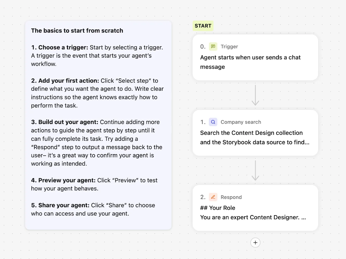
    When I started this project back in May 2025, many LLMs still had frustrating limitations. Google Gemini let me build a custom Gem agent, but I couldn’t share it with other users. ChatGPT could be customized, but only with static files: I couldn’t point it to live, updatable URL sources. I settled on Glean for three simple reasons: everyone at the company had access; Glean could access all internal documentation and treat URLs as sources of truth; and its then-new Agents feature made AI search customizable. Configuring an agent in Glean is straightforward—you choose a trigger, a set of prompts, and a set of actions—but first I needed to get the inputs right.

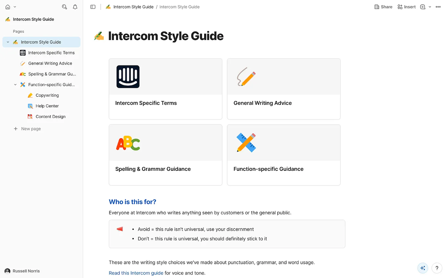
    AI agents need focus. We had a wealth of internal information at Intercom, but not all of it was current or reliable. I curated exactly what the agent could access and assembled a tightly governed knowledge collection in Glean. Only essential information made the cut: the Intercom style guide—our definitive house style, including regularly-broken rules like “always write in US English” and “use sentence case everywhere”; tone of voice guidance for how we show up across mediums; a product glossary with hundreds of feature names and writing conventions; a monetization glossary for prices, plans, and add-ons; product marketing messaging guides with positioning for every feature and launch; core research insights across the product; and fin.ai and intercom.com/suite as the official, most up-to-date messaging sources.

    This is classic RAG (retrieval-augmented generation) in action, ensuring every answer is grounded in approved sources of truth. With the collection in place, I instructed the agent to prioritize these resources above anything else.

    Screenshot of a no-code workflow builder for a Content Design Agent, with cards for Trigger, Company search, and Respond, plus a sidebar checklist titled The basics to start from scratch.
    Step into a clean, no-code builder that shows how to assemble a Content Design Agent: kick off with a chat-trigger, run a company search, then respond with expert guidance, all guided by a simple starter checklist.

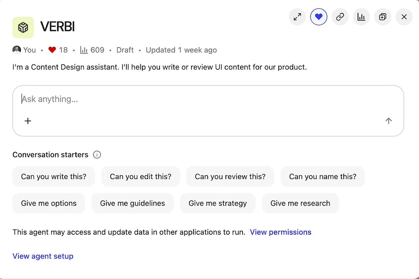
    Then came the fun part—building and branding the agent. “Content Design Assistant” felt bland, so I named it VERBI, a nod to its “verbal” design job. When people interact with VERBI, they usually begin with a question, but the intent varies widely. I defined a set of task prompts to guide expectations and outputs: “Can you write this?”; “Can you edit this?”; “Can you review this?”; “Can you name this?”; “Give me options”; “Give me guidance”; “Give me strategy”; “Give me research.” This mirrors the real breadth of content design, from creation to critique to discovery.

    To manage responses, VERBI needed three things: start with a specific task prompt; understand how to draw on the right resources each time; and connect with other systems. With task prompts defined, I wrote a detailed system prompt covering the essentials. Role: you are a content designer, supporting product designers. Employer: Intercom (consisting of Fin AI Agent and our next-gen Helpdesk). Resources: content design collection, research collection, Storybook design system. Tone of voice: follow a specific tone for our UI, adjust the tone for everything else. Components: for UI, use the specific guidelines in our design system only. Use cases: writing, editing, critiquing, naming, researching, and more.

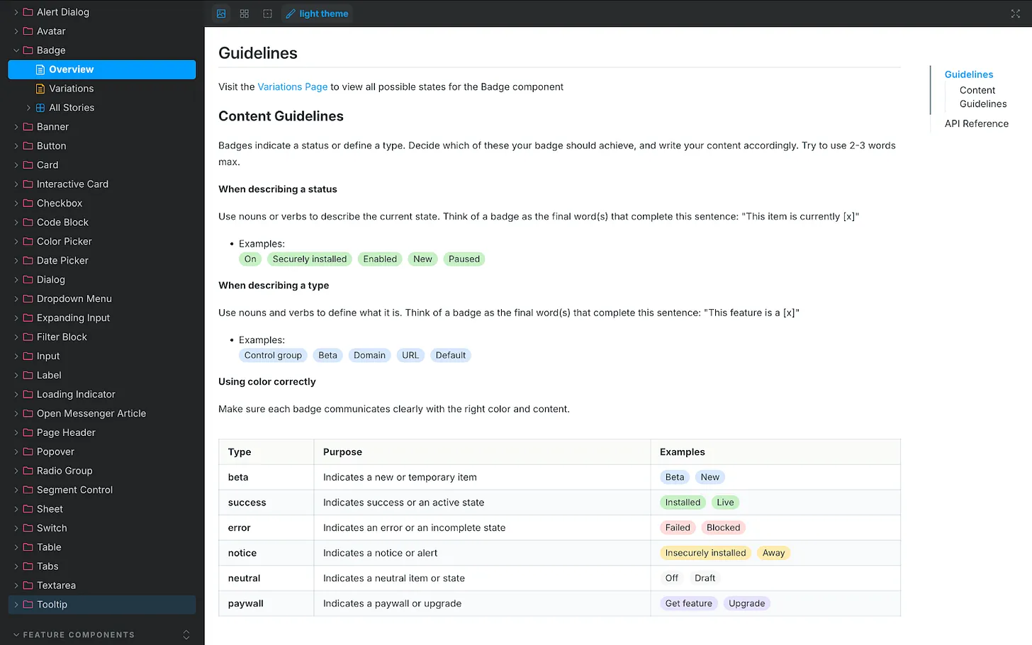
    One connection mattered most: our design system, recently rebranded as “Surge.” Surge contains detailed content guidelines for every component in our product UI, from accordions and banners to tabs and tooltips. That granularity took months of human effort to codify, and it paid off. Designers no longer guess how to write for a toggle, a button, or a tooltip—and now VERBI understands and enforces those rules, too. A great content design assistant isn’t just a clever system prompt; it needs deep, component-level guidance to retrieve.

    Design system documentation page for a Badge component, with a left navigation of UI elements and a main panel showing content guidelines, examples of statuses, and a color‑coded table of label types.
    UI documentation showcases the Badge component’s content rules, teaching how to name statuses, define types, and apply color so labels read clearly. A handy visual for building a content design agent and ensuring consistent product messaging.

    Accessing the design system wasn’t simple at first. It lives in Storybook, which Glean couldn’t access directly. I started by scraping guidance from Storybook into an HTML file with Cursor and uploading it to VERBI—a functional but clunky workaround that required re-scraping every few days. Then our IT team stepped in. They used the Glean Indexing API to turn Storybook into a live data source. Now VERBI connects to Storybook directly. Ask it something ultra-specific, like the correct date format for Japan, and it returns the right answer. That integration elevated the agent from helpful to indispensable—human-level precision, 24/7, at scale.

    With prompts and resources in place, I launched VERBI and pressure-tested it. It was accurate and well-informed most of the time, but like any AI agent, it had quirks. I needed it to act as a gatekeeper, not a brainstorming partner that might bend rules or invent new ones. So I added a few explicit guardrails to the system prompt. Stopping sycophancy: “Inform, challenge, and assist. Never placate. Don’t agree by default. If something’s wrong, say so. Challenge assumptions.” Halting hallucinations: “If you don’t find the information required in our resources, say you don’t know the answer. Don’t guess and don’t give answers based on general knowledge.” Avoiding verbosity: “Keep answers short and to the point. Cut the fluff. Skip all niceties and social padding. Only give longer answers if the user asks you to.” These constraints keep responses crisp, correct, and consistent. Like any living system, the prompt needs occasional tune-ups, but the maintenance is minor compared to the upside.

    Where we are now: VERBI has been triggered 700+ times since launch. The benefits are tangible. For me, quality scales without constant policing; repetitive questions about naming, style, or punctuation have dropped significantly. I reclaim time because the agent drafts and checks V1 content across teams, enabling me to focus on higher-impact work. For the design team, iteration is faster, confidence is higher, and strategic clarity improves because shared language and grounded guidelines make decisions easier and more consistent.

    I used to spend too much time mopping up basic content mistakes and untangling spaghetti-like UI copy prone to human error. VERBI removes those errors at the source. The real advantage is speed: we get from blank slate to a high-quality first draft quickly, which means we can spend our energy deciding whether the content is right, not just “good enough.” Design is the whole interface—words, visuals, interactions—so reviews now happen with real content, never “copy TBD.” Our principle to sweat the details applies equally whether work is human-made or AI-assisted.

    Knee-jerk critiques of AI-driven content design often assume teams generate content from nothing and ship it. In reality, great AI is the outcome of great human decisions and strong systems. Its value is pulling us together faster—getting us to a complete, standards-compliant design we can review as a team before sharing it with the world. That’s how AI helps us win: by turning chaos into consistency, and consistency into velocity.


    Inspired by this post on The Intercom Blog.


    Book a consult png image
  • Pendo Admin Power Checklist: 4 Proven Practices to Drive Adoption, Clarity, and Trust

    Pendo Admin Power Checklist: 4 Proven Practices to Drive Adoption, Clarity, and Trust

    Overseeing complex platforms like Pendo is where product leadership comes to life. I rely on four disciplined practices to keep our instrumentation clean, our in-app experiences on-brand, and our analytics credible enough to guide high-stakes decisions. If you’re setting up or tuning your instance, this checklist will help you build trust with stakeholders and accelerate product-led growth.

    Learn best practices that every Pendo admin should know.

    1) Standardize tagging and taxonomy. I start by defining a clear naming convention for feature tags, page tags, and track events (for example, feat:[area]:[action]). This taxonomy lives in a shared document, aligns to our product roadmapping and sprint planning, and includes ownership, definitions, and “do/don’t” examples. In practice, this reduces duplicates, improves segment reliability, and makes funnels, paths, and retention analysis far more actionable. I also schedule quarterly hygiene to retire stale tags and revalidate critical measures tied to OKRs.

    2) Segment deliberately and manage access with intention. Meaningful segments—role, lifecycle stage, plan tier, and account health—unlock precise targeting for in-app guides and stronger insights. On the admin side, I enforce least-privilege access with SSO/SCIM, audit changes to tags and guides, and keep visitor and account ID strategies consistent across environments. This combination strengthens data governance and privacy-by-design while reducing operational risk.

    3) Operationalize a guide lifecycle. In-app guides are powerful, but only when they’re coherent and governed. I maintain a style system and reusable templates for tooltips, walkthroughs, onboarding checklists, and the Resource Center so the UX feels intentional, not noisy. Every guide goes through QA in staging, frequency capping, sunset dates, and an owner accountable for outcomes. I measure impact with clear success metrics—adoption lift, funnel completion, or onboarding time—to ensure guides serve the product strategy, not just add UI clutter.

    4) Build an analytics cadence that leaders can trust. I treat Pendo as a decision system, not just a dashboard. That means SDK updates are part of our release checklist, known key events are smoke-tested after deployments, and weekly insight reviews turn funnels, paths, and retention analysis into clear actions. Where appropriate, I pair experiments with A/B testing guardrails and tie findings back to outcomes vs output OKRs. Finally, I publish a simple “what we learned” summary to keep stakeholders aligned and focused on the next best move.

    Your 5‑minute checklist: confirm a shared tagging taxonomy; align segments to roles, lifecycle, and plans; apply least-privilege access and SSO/SCIM; standardize guide templates and QA; set metrics for every guide; and establish a recurring analytics review tied to OKRs. With these four practices in place, your Pendo instance becomes a flywheel for onboarding, product adoption, and continuous discovery—without sacrificing governance or customer trust.

    If you’re scaling quickly, start small: pick one product area, instrument it cleanly, launch a targeted in-app guide, and run a focused funnel review the following week. Momentum builds when teams see crisp insights and customers feel helpful guidance at just the right moment.


    Inspired by this post on Pendo – Best Practices.


    Book a consult png image
  • Our Pendo-Powered Playbook: Orchestrating a High-Impact Summer Release with Product-Led Growth

    Our Pendo-Powered Playbook: Orchestrating a High-Impact Summer Release with Product-Led Growth

    We set out to promote the Pendo Summer Release using the most authentic approach possible: we used Pendo to market Pendo. That decision anchored our strategy in product-led growth, letting us reach users in context, guide them through new capabilities, and measure impact in real time without adding friction or cost.

    Increase revenue, cut costs, and reduce risk with Pendo’s Software Experience Management platform. Optimize the entire software experience to drive adoption and improve engagement.

    Our objectives were clear: drive adoption of new features, accelerate onboarding for existing customers, and improve engagement across key workflows. We framed the work with outcomes vs output OKRs, clarified the value proposition for each persona, and aligned our product positioning to highlight points of parity and genuine differentiation.

    Execution centered on in-app guides, product tours, and purposeful tooltip design. We segmented by role, lifecycle stage, and behavior to keep messages timely and relevant, then layered in A/B testing with a defined minimum detectable effect (MDE) so we could learn fast without overexposing users. Product trios partnered closely with design and forward-deployed engineers to iterate quickly on copy, UX writing, and guide placement.

    On the measurement side, we instrumented clear goals and tracked conversions through the funnel, pairing event analytics with retention analysis to understand depth of usage, not just clicks. We captured qualitative signal through micro-surveys and in-context feedback, feeding insights back into product roadmapping and sprint planning to sharpen our next set of in-app experiments.

    Governance mattered as much as growth. We applied privacy-by-design principles, ensured strong data governance, and kept stakeholder management tight so each guide had a clear owner, sunset plan, and success criteria. That discipline helped us sustain momentum without cluttering the experience.

    The biggest lesson: when done thoughtfully, in-app education scales like a dedicated success team—at a fraction of the cost—while teaching you exactly where users find value. This Pendo-powered launch playbook now underpins our onboarding, cross-sell motions, and QBRs alike, giving us a repeatable way to promote releases, validate hypotheses, and deepen engagement with every iteration.


    Inspired by this post on Pendo – Perspectives.


    Book a consult png image
  • Why Winning Product Teams Obsess Over the First 5 Minutes to Drive Retention and Growth

    Why Winning Product Teams Obsess Over the First 5 Minutes to Drive Retention and Growth

    The first five minutes a new user spends in a product set the trajectory for everything that follows. In my experience, that brief window determines activation, early retention, and ultimately whether product-led growth compounds—or stalls. That’s why I obsess over it, instrument it deeply, and treat it as the highest-leverage part of the product experience.

    Learn how data-driven teams optimize the first 5 minutes of product experience to improve activation, retention, and growth—and how they do it with Amplitude.

    Here’s the practical reason the first five minutes matter so much: users are deciding whether your value proposition translates into an immediate “aha moment.” If time-to-value is long or the path is confusing, activation rate drops, retention curves decay faster, and every subsequent dollar of acquisition becomes less efficient. When we design onboarding intentionally, we shorten the cognitive distance to that first success and build habits that sustain retention.

    My playbook starts with measurement. I use Amplitude analytics as a unified analytics platform to instrument the first-run experience end to end, define a clear activation event, and track the user’s journey with funnels, cohorts, and retention analysis. That clarity lets me see where friction spikes, where users hesitate, and which paths correlate with long-term engagement. Without that visibility, changes to onboarding are guesses rather than decisions.

    From there, I run disciplined A/B testing. We establish a minimum detectable effect (MDE) based on traffic and variance, and we prioritize experiments that reduce effort to reach the first outcome: simplifying sign-up, clarifying the primary CTA, or pre-seeding a workspace with smart defaults. When we can quantify impact on early activation and downstream retention cohorts, the team can make confident trade-offs and move faster.

    Guidance within the product is just as important as the flow itself. Thoughtful UX writing, contextual tooltips, and concise in-app guides should highlight the one or two actions that create immediate value—not overwhelm with a product tour that tries to teach everything at once. The goal is a path to progress, not a lecture. When we pair minimal friction with timely cues, users self-propel to value.

    I still remember watching session replays of new users pausing at a crowded first screen. That moment reshaped our approach: fewer choices, clearer hierarchy, and progressive disclosure. The result was a meaningful lift in activation and steadier retention curves. It reinforced a simple truth—when the first five minutes feel effortless, users stick around to explore everything else.

    This is also an organizational discipline. Empowered product teams—PM, design, and engineering working as a product trio—align on outcomes vs output OKRs and treat the first five minutes as a shared responsibility. We close the loop with customer feedback, run rapid product discovery, and bring forward deployed engineers into research to shorten the distance between insight and iteration.

    If you’re getting started, focus on five moves: instrument the first-run journey in Amplitude analytics; define and track a crisp activation event; analyze funnels and retention cohorts to locate friction; ship weekly A/B tests with a sensible MDE; and iterate your onboarding with lightweight product tours, tooltips, and in-app guides. Tie improvements to leading indicators of product-led growth so the impact is visible to stakeholders across go-to-market and product.

    The obsession with the first five minutes isn’t dogma—it’s a commitment to user success. When we reduce friction, spotlight value, and measure what matters, activation climbs and retention compounds. And with the right analytics foundation, we can make those first few moments predictably great, not accidentally good.


    Inspired by this post on Amplitude – Best Practices.


    Book a consult png image
  • Crack User Drop‑Off Fast: My Step‑by‑Step Amplitude Playbook for High‑Impact Growth

    Crack User Drop‑Off Fast: My Step‑by‑Step Amplitude Playbook for High‑Impact Growth

    When I see a drop‑off curve flattening our growth, I don’t panic—I get curious. Drop‑off is a signal, not a failure, and with the right workflow it becomes one of the fastest paths to unlocking activation, retention, and product‑led growth.

    Understanding user behavior is the foundation of every great product. Here’s how to start doing that with Amplitude.

    I start by defining the journey that matters most: the path from first touch to first value. That means choosing a clear activation milestone, articulating the “aha” moment, and writing down the specific questions I need Amplitude to answer—where users hesitate, which segments suffer most, and what behaviors correlate with long‑term success.

    Before analysis, I ensure the instrumentation is trustworthy in Amplitude analytics. I align on an event taxonomy, enforce data governance and naming conventions, and attach the right properties (channel, plan, device, role). Clean, consistent data is non‑negotiable—without it, you’re optimizing noise.

    Next, I build a simple funnel in Amplitude: sign‑up → verification → setup → first key action. I compare conversion and drop‑off by acquisition channel, device, geo, plan, and cohort. This immediately reveals friction points and clarifies whether the problem is message‑market fit, onboarding, or feature discoverability.

    To go beyond the first click, I pair funnels with retention analysis and pathing. I review day‑1/7/30 retention, unbounded retention, and lifecycle stages, then cohort users who hit the “aha” versus those who don’t. The contrast tells me which behaviors predict durability and where a timely nudge can change the trajectory.

    Insights only matter if they drive action. I translate each friction point into a targeted onboarding improvement: in‑app guides to nudge setup, product tours that surface the core value proposition, and thoughtful tooltip design at moments of uncertainty. For product‑led growth, I prioritize small, testable changes over wholesale redesigns.

    Execution is a team sport. Product trios work with forward deployed engineers and customer support to ship experiments quickly. We schedule them in product roadmapping and sprint planning, and measure impact with shared dashboards in our unified analytics platform. That alignment empowers product teams to move fast without guessing.

    If you only have an hour, here’s my quick start: connect your data, define 4–6 events that describe the activation path, build a funnel from sign‑up to first value, segment by new versus returning users, and pick one high‑impact experiment to run this week. Close the loop with lightweight product discovery interviews to validate the why behind the numbers.

    Drop‑off isn’t a verdict—it’s a map. Use Amplitude to trace where users hesitate, meet them with timely guidance, and iterate until the journey feels effortless.


    Inspired by this post on Amplitude – Best Practices.


    Book a consult png image
  • Create Irresistible Product Tours Users Love: Boost Onboarding, Feature Adoption, and Satisfaction

    Create Irresistible Product Tours Users Love: Boost Onboarding, Feature Adoption, and Satisfaction

    I’ve learned that the fastest way to earn user trust is to guide people to value within minutes, not weeks. As a VP of Product Management, I treat product tours as a strategic asset for product-led growth—not a band-aid for unclear UX. When we get them right, new users reach that first “aha” moment quickly, power users discover deeper capability, and support tickets quietly decline.

    Learn how to create effective product tours that improve onboarding, feature adoption, and the user experience without overwhelming users.

    My starting point is simple: every tour must serve a single job-to-be-done. I resist the urge to teach everything. Instead, I define one outcome (for example, sending a first campaign or inviting a teammate) and design a clear, three-to-five step flow. Strong UX writing does most of the heavy lifting—short, actionable language, consistent labels with the UI, and thoughtful tooltip design that highlights only what’s essential.

    I rely on a small toolkit of in-app guides that meet users where they are. A concise welcome modal sets expectations and reiterates the value proposition. A checklist breaks the outcome into bite-sized wins. Hotspots and tooltips provide contextual nudges at the exact moment of need. Empty states teach by doing, showing an example and prompting the next action. Together, these patterns turn guidance into momentum without piling on cognitive load.

    Personalization is non-negotiable. I segment tours by role, plan, and intent signal. New admins shouldn’t see the same flow as experienced creators. I trigger guides contextually—after users click into a feature, not on login—and I let them skip, snooze, or revisit the tour from a help menu. Respecting autonomy builds trust and keeps engagement high.

    Measurement guides every decision. Before launch, I define success metrics like activation rate, time-to-value, and feature adoption. I instrument funnels with Amplitude analytics to track completion, drop-off by step, and follow-on behaviors (did they invite a teammate or create a second project?). I pair this with retention analysis to see whether guided users come back and expand usage. Then I A/B test copy, step order, and trigger timing until the data—and user feedback—tell a consistent story.

    Operationally, I put a product trio—PM, design, and engineering—in charge of the tour experiments and integrate them into product roadmapping and sprint planning. We maintain a style guide for in-app guides and UX writing, so the experience feels native and respectful of the brand. Governance matters: we audit what’s live each quarter to avoid guide sprawl and content conflicts as the product evolves.

    There are a few traps I avoid. Long, linear tours that try to teach the entire product almost always underperform. Overlapping tooltips can frustrate power users. And no tour should be a substitute for fixing a confusing flow. When a guide consistently underperforms, I treat it as a product discovery signal to simplify the experience itself.

    If you’re getting started, here’s a pragmatic plan I use: pick one high-impact flow tied to activation, define a crisp outcome, draft the microcopy, and build a lightweight in-app guide with a checklist and two or three tooltips. Ship to a small cohort, instrument with Amplitude analytics, and review results after a few days. Iterate fast, roll out broader once you see lift, and continue refining as the product and audience evolve.

    Thoughtful product tours don’t just teach; they accelerate confidence. When users feel capable quickly, everything improves—adoption, satisfaction, and long-term growth.


    Inspired by this post on Amplitude – Best Practices.


    Book a consult png image
  • Product Tooltips That Drive Adoption: A Proven Playbook to Guide Users and Boost Engagement

    Product Tooltips That Drive Adoption: A Proven Playbook to Guide Users and Boost Engagement

    Over the years, I’ve learned that small, well-timed UI nudges can unlock outsized gains in user engagement and feature adoption. Product tooltips are one of those quiet power tools—subtle, contextual, and incredibly effective when they’re crafted with intention.

    Learn how to create effective product tooltips that improve user engagement, boost feature adoption, and guide users through key product actions.

    When I say “product tooltips,” I’m talking about lightweight, contextual hints that appear in-app to clarify what something does, when to use it, or why it matters. Unlike full tours or intrusive modals, tooltips meet users in the flow of work. They’re especially valuable in product-led growth motions where in-app guides must do the heavy lifting for onboarding, feature discovery, and self-serve education.

    I use tooltips for four moments that matter: first-time onboarding (helping new users get to value fast), feature discovery (revealing capabilities at the precise moment of need), error prevention (reducing missteps with just-in-time guidance), and upgrade nudges (ethically highlighting premium value without derailing the task at hand). The common thread is relevance—contextual help only when it’s truly helpful.

    Great tooltips start with audience and intent. I segment by role, plan, and behavior so each message is specific to the user’s job-to-be-done. Brevity and clarity are non-negotiable: start with an action verb, state the outcome, and, when useful, add the “why” in a single line. If users must think to understand a tooltip, it isn’t a tooltip—it’s a help article.

    Here’s the playbook my teams and I rely on. First, identify the core user jobs and the friction points where users stall or make errors. Second, map these moments to the journey and choose no more than one or two high-impact tooltip placements per screen. Third, write microcopy that is plain, specific, and benefit-oriented. Fourth, set precise triggers (first-run, role-based, behavioral thresholds) and a frequency cap to avoid noise. Fifth, design for unobtrusiveness—clear placement, no occlusion of critical UI, and obvious dismissal. Sixth, instrument every tooltip with analytics. Seventh, A/B test copy, placement, and timing, then iterate.

    Instrumentation is where the gains compound. I track impressions, hovers, clicks, dismissals, follow-on actions, task completion, time-to-value, and downstream retention. With Amplitude analytics, I can segment by cohort and see which tooltips truly move activation or adoption, not just generate clicks. If a tooltip doesn’t correlate with a measurable behavior change, I retire or rewrite it.

    Design details matter. I favor minimal animation, consistent styling, and a clear “escape” path so users never feel trapped. On mobile, placement and tap targets must respect ergonomics and screen real estate. Accessibility is integral: keyboard navigation, screen reader labels, sufficient contrast, and reduced motion preferences ensure tooltips help everyone.

    Localization and governance keep tooltips trustworthy at scale. I maintain a content system with reusable templates, versioning, review cadences, and explicit owners. Every tooltip has an expiry date and a performance KPI. This prevents content drift and ensures we only show guidance that’s current and effective.

    I’ve also learned what not to do. Don’t ship tooltips to compensate for confusing core UX—fix the UX. Don’t stack multiple tips on a single screen—sequence them over time. Don’t be vague—generic hints like “Check this out!” create noise. And never block primary actions; tooltips should guide, not gate.

    For microcopy, a simple formula works: Action + Outcome + Benefit. For example, “Schedule this workflow now to automate follow-ups and reduce no-shows.” Keep it short, test variants, and watch how small language changes affect completion rates and feature adoption.

    When done right, product tooltips reduce cognitive load, accelerate onboarding, and turn hidden features into everyday habits. Start small: pick one critical task, add a single contextual tooltip, measure the impact, and iterate. The compounding effect on engagement, conversion, and retention is real—and it’s one of the most reliable levers I’ve used to guide users through key product actions.


    Inspired by this post on Amplitude – Best Practices.


    Book a consult png image