
Over the years, I’ve learned that small, well-timed UI nudges can unlock outsized gains in user engagement and feature adoption. Product tooltips are one of those quiet power tools—subtle, contextual, and incredibly effective when they’re crafted with intention.
Learn how to create effective product tooltips that improve user engagement, boost feature adoption, and guide users through key product actions.
When I say “product tooltips,” I’m talking about lightweight, contextual hints that appear in-app to clarify what something does, when to use it, or why it matters. Unlike full tours or intrusive modals, tooltips meet users in the flow of work. They’re especially valuable in product-led growth motions where in-app guides must do the heavy lifting for onboarding, feature discovery, and self-serve education.
I use tooltips for four moments that matter: first-time onboarding (helping new users get to value fast), feature discovery (revealing capabilities at the precise moment of need), error prevention (reducing missteps with just-in-time guidance), and upgrade nudges (ethically highlighting premium value without derailing the task at hand). The common thread is relevance—contextual help only when it’s truly helpful.
Great tooltips start with audience and intent. I segment by role, plan, and behavior so each message is specific to the user’s job-to-be-done. Brevity and clarity are non-negotiable: start with an action verb, state the outcome, and, when useful, add the “why” in a single line. If users must think to understand a tooltip, it isn’t a tooltip—it’s a help article.
Here’s the playbook my teams and I rely on. First, identify the core user jobs and the friction points where users stall or make errors. Second, map these moments to the journey and choose no more than one or two high-impact tooltip placements per screen. Third, write microcopy that is plain, specific, and benefit-oriented. Fourth, set precise triggers (first-run, role-based, behavioral thresholds) and a frequency cap to avoid noise. Fifth, design for unobtrusiveness—clear placement, no occlusion of critical UI, and obvious dismissal. Sixth, instrument every tooltip with analytics. Seventh, A/B test copy, placement, and timing, then iterate.
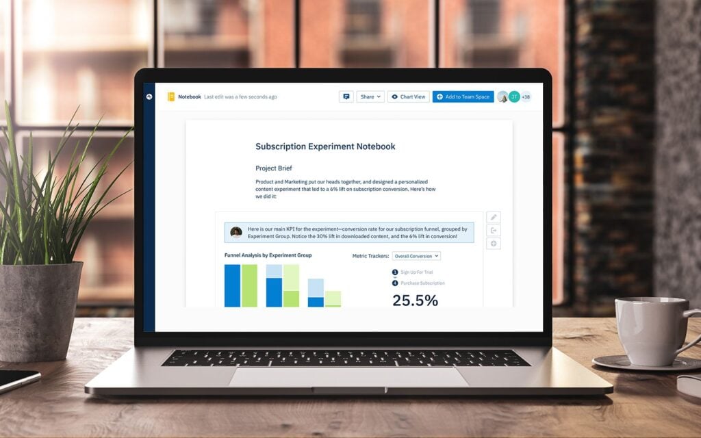
Instrumentation is where the gains compound. I track impressions, hovers, clicks, dismissals, follow-on actions, task completion, time-to-value, and downstream retention. With Amplitude analytics, I can segment by cohort and see which tooltips truly move activation or adoption, not just generate clicks. If a tooltip doesn’t correlate with a measurable behavior change, I retire or rewrite it.
Design details matter. I favor minimal animation, consistent styling, and a clear “escape” path so users never feel trapped. On mobile, placement and tap targets must respect ergonomics and screen real estate. Accessibility is integral: keyboard navigation, screen reader labels, sufficient contrast, and reduced motion preferences ensure tooltips help everyone.
Localization and governance keep tooltips trustworthy at scale. I maintain a content system with reusable templates, versioning, review cadences, and explicit owners. Every tooltip has an expiry date and a performance KPI. This prevents content drift and ensures we only show guidance that’s current and effective.
I’ve also learned what not to do. Don’t ship tooltips to compensate for confusing core UX—fix the UX. Don’t stack multiple tips on a single screen—sequence them over time. Don’t be vague—generic hints like “Check this out!” create noise. And never block primary actions; tooltips should guide, not gate.
For microcopy, a simple formula works: Action + Outcome + Benefit. For example, “Schedule this workflow now to automate follow-ups and reduce no-shows.” Keep it short, test variants, and watch how small language changes affect completion rates and feature adoption.
When done right, product tooltips reduce cognitive load, accelerate onboarding, and turn hidden features into everyday habits. Start small: pick one critical task, add a single contextual tooltip, measure the impact, and iterate. The compounding effect on engagement, conversion, and retention is real—and it’s one of the most reliable levers I’ve used to guide users through key product actions.
Inspired by this post on Amplitude – Best Practices.


Leave a Reply