
I’ve learned the hard way that more charts don’t equal more clarity. One challenge that comes with this is knowing what matters at the right level of leadership. Executives everywhere are busy, and they don’t need the nitty-gritty details to do their jobs well. When I’m operating at the VP level, I rely on just three dashboards that give me fast signal, reduce noise, and keep teams aligned to outcomes—not output.
These dashboards sit on top of a unified analytics platform that connects product analytics (Amplitude analytics or Pendo), CRM and revenue data (e.g., HubSpot), billing, and support signals. Consistent definitions, data governance, and outcomes vs output OKRs ensure we’re making decisions with confidence, not gut feel. The goal is simple: a shared, executive-ready view that ties product strategy to business impact.
Dashboard 1: Outcomes and Strategy Alignment. This is the north star view I use to orient the company. It highlights ARR, NRR, and GRR trends; progress against our outcomes vs output OKRs; our product-led growth funnel; and our primary value proposition metric (e.g., activation-to-time-to-value). I include a 12-month view with quarter-over-quarter deltas, a short written narrative, and the top three strategic bets we’re funding. In board management and QBRs vs OKRs discussions, this keeps focus on what we achieved, what moved, and what we’re changing next.
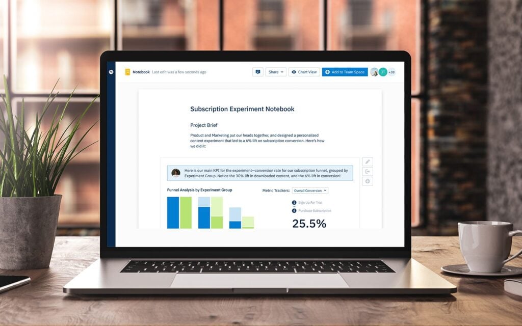
Dashboard 2: Customer Value, Adoption, and Retention. This is where retention analysis meets product discovery. I track activation rate, time-to-value, feature adoption cohorts (from Amplitude analytics or Pendo), retention curves by segment, and expansion vs contraction signals. Leading indicators include NPS and CES alongside qualitative themes from support and sales. I also monitor funnel drop-offs and in-app guides or product tours performance to see where users get stuck. The intent is to connect behavior to revenue so we can prioritize changes that actually improve customer outcomes.
Dashboard 3: Execution Health and Quality. This helps me assess whether our operating system is working. I look at delivery predictability against product roadmapping and sprint planning, cycle time and throughput, escaped defects, incident volume, and MTTR. I also review experiment velocity and A/B testing readiness (including minimum detectable effect) to ensure we’re learning at pace. Resource allocation across strategic initiatives and a clear risk register support proactive stakeholder management.
I review these dashboards weekly with my product trios and monthly with cross-functional leaders, then synthesize a concise narrative for the executive team and the board. Each dashboard is a decision engine: it has an owner, a single source of truth, clear thresholds, and a list of next actions. By grounding conversations in the same views, we reduce back-and-forth and keep momentum high.
A few implementation rules have served me well: keep the signal dense and the visuals simple; lock metric definitions and ownership; avoid vanity metrics; and instrument privacy-by-design from the start. When data is trustworthy and the story is tight, teams focus on the right problems and progress compounds.
If you find yourself wading through dozens of reports, try consolidating to these three executive dashboards. You’ll spend less time arguing about the data and more time driving product-led growth, accelerating alignment, and delivering customer value at scale.
Inspired by this post on Pendo – Best Practices.


Leave a Reply