When I see a drop‑off curve flattening our growth, I don’t panic—I get curious. Drop‑off is a signal, not a failure, and with the right workflow it becomes one of the fastest paths to unlocking activation, retention, and product‑led growth.
Understanding user behavior is the foundation of every great product. Here’s how to start doing that with Amplitude.
I start by defining the journey that matters most: the path from first touch to first value. That means choosing a clear activation milestone, articulating the “aha” moment, and writing down the specific questions I need Amplitude to answer—where users hesitate, which segments suffer most, and what behaviors correlate with long‑term success.
Before analysis, I ensure the instrumentation is trustworthy in Amplitude analytics. I align on an event taxonomy, enforce data governance and naming conventions, and attach the right properties (channel, plan, device, role). Clean, consistent data is non‑negotiable—without it, you’re optimizing noise.
Next, I build a simple funnel in Amplitude: sign‑up → verification → setup → first key action. I compare conversion and drop‑off by acquisition channel, device, geo, plan, and cohort. This immediately reveals friction points and clarifies whether the problem is message‑market fit, onboarding, or feature discoverability.
To go beyond the first click, I pair funnels with retention analysis and pathing. I review day‑1/7/30 retention, unbounded retention, and lifecycle stages, then cohort users who hit the “aha” versus those who don’t. The contrast tells me which behaviors predict durability and where a timely nudge can change the trajectory.
Insights only matter if they drive action. I translate each friction point into a targeted onboarding improvement: in‑app guides to nudge setup, product tours that surface the core value proposition, and thoughtful tooltip design at moments of uncertainty. For product‑led growth, I prioritize small, testable changes over wholesale redesigns.
Execution is a team sport. Product trios work with forward deployed engineers and customer support to ship experiments quickly. We schedule them in product roadmapping and sprint planning, and measure impact with shared dashboards in our unified analytics platform. That alignment empowers product teams to move fast without guessing.
If you only have an hour, here’s my quick start: connect your data, define 4–6 events that describe the activation path, build a funnel from sign‑up to first value, segment by new versus returning users, and pick one high‑impact experiment to run this week. Close the loop with lightweight product discovery interviews to validate the why behind the numbers.
Drop‑off isn’t a verdict—it’s a map. Use Amplitude to trace where users hesitate, meet them with timely guidance, and iterate until the journey feels effortless.
Inspired by this post on Amplitude – Best Practices.
When I need fast, trustworthy insight into what to build next, I turn to product surveys. Done well, they feel respectful, take minutes, and deliver signal we can ship against. Done poorly, they frustrate users and mislead product teams. Over the years, I’ve refined a simple, repeatable approach that consistently yields high response rates and actionable insights across product discovery, onboarding, and product-led growth motions.
Create effective product surveys that capture actionable user feedback, improve features, and support smarter product decisions.
I always start with the decision I need to make. Am I validating a value proposition, prioritizing a feature, diagnosing friction in onboarding, or measuring retention risk? That clarity shapes everything—who I ask, when I ask, and how I phrase the questions. It also aligns the survey with outcomes, not outputs, so results directly inform product roadmapping and sprint planning instead of becoming a vanity report.
Question design is where UX writing discipline pays off. I keep surveys short (5–7 questions), bias-free, and written in the same voice we use in-app. I mix two or three crisp quant questions (e.g., confidence, usefulness, likelihood to continue) with one or two open-ended prompts to surface the “why.” That blend gives me both trend lines and the qualitative texture I need to make confident trade-offs with stakeholders.
Timing and targeting often matter more than question count. I trigger in-app micro-surveys at meaningful moments—right after a user finishes onboarding, explores a product tour, or engages with a newly released feature. For deeper discovery, I segment cohorts (new vs. power users, retained vs. churning) to avoid muddy averages. The right context earns higher completion rates and more honest feedback.
Trust drives participation. I set expectations upfront: how long it will take, why it matters, and how their feedback will shape the roadmap. I also share back the outcome—what we learned and what we shipped—so users see the loop closing. That simple follow-up builds goodwill and sustains response rates over time.
On analysis, I combine lightweight quant with rigorous qualitative synthesis. I chart response and completion rates, then use thematic coding on open text to spot repeating patterns. Where it helps, I apply gen AI to accelerate clustering and sentiment analysis, then validate the themes manually. Finally, I triangulate with product telemetry in Amplitude analytics to confirm that what users say matches what they do.
The most valuable step is translation: turning feedback into decisions. I map insights to clear problem statements, rank them by user impact and strategic fit, and convert them into opportunities on our roadmap. In planning, I pair these opportunities with success metrics tied to activation, adoption, or retention analysis, so we can measure whether changes actually move the needle.
Surveys aren’t a substitute for interviews, but they’re a powerful complement. They help me spot signals at scale, de-risk bets between cycles, and align cross-functional stakeholders around evidence rather than opinions. When surveys are concise, contextual, and connected to action, users feel heard—and teams ship smarter.
Inspired by this post on Amplitude – Best Practices.
I’ve learned that the fastest way to earn user trust is to guide people to value within minutes, not weeks. As a VP of Product Management, I treat product tours as a strategic asset for product-led growth—not a band-aid for unclear UX. When we get them right, new users reach that first “aha” moment quickly, power users discover deeper capability, and support tickets quietly decline.
Learn how to create effective product tours that improve onboarding, feature adoption, and the user experience without overwhelming users.
My starting point is simple: every tour must serve a single job-to-be-done. I resist the urge to teach everything. Instead, I define one outcome (for example, sending a first campaign or inviting a teammate) and design a clear, three-to-five step flow. Strong UX writing does most of the heavy lifting—short, actionable language, consistent labels with the UI, and thoughtful tooltip design that highlights only what’s essential.
I rely on a small toolkit of in-app guides that meet users where they are. A concise welcome modal sets expectations and reiterates the value proposition. A checklist breaks the outcome into bite-sized wins. Hotspots and tooltips provide contextual nudges at the exact moment of need. Empty states teach by doing, showing an example and prompting the next action. Together, these patterns turn guidance into momentum without piling on cognitive load.
Personalization is non-negotiable. I segment tours by role, plan, and intent signal. New admins shouldn’t see the same flow as experienced creators. I trigger guides contextually—after users click into a feature, not on login—and I let them skip, snooze, or revisit the tour from a help menu. Respecting autonomy builds trust and keeps engagement high.
Measurement guides every decision. Before launch, I define success metrics like activation rate, time-to-value, and feature adoption. I instrument funnels with Amplitude analytics to track completion, drop-off by step, and follow-on behaviors (did they invite a teammate or create a second project?). I pair this with retention analysis to see whether guided users come back and expand usage. Then I A/B test copy, step order, and trigger timing until the data—and user feedback—tell a consistent story.
Operationally, I put a product trio—PM, design, and engineering—in charge of the tour experiments and integrate them into product roadmapping and sprint planning. We maintain a style guide for in-app guides and UX writing, so the experience feels native and respectful of the brand. Governance matters: we audit what’s live each quarter to avoid guide sprawl and content conflicts as the product evolves.
There are a few traps I avoid. Long, linear tours that try to teach the entire product almost always underperform. Overlapping tooltips can frustrate power users. And no tour should be a substitute for fixing a confusing flow. When a guide consistently underperforms, I treat it as a product discovery signal to simplify the experience itself.
If you’re getting started, here’s a pragmatic plan I use: pick one high-impact flow tied to activation, define a crisp outcome, draft the microcopy, and build a lightweight in-app guide with a checklist and two or three tooltips. Ship to a small cohort, instrument with Amplitude analytics, and review results after a few days. Iterate fast, roll out broader once you see lift, and continue refining as the product and audience evolve.
Thoughtful product tours don’t just teach; they accelerate confidence. When users feel capable quickly, everything improves—adoption, satisfaction, and long-term growth.
Inspired by this post on Amplitude – Best Practices.
Early in any market, I obsess over one thing before splashy features or clever messaging: are we meeting the table stakes that buyers expect? Points of parity (POPs) are the baseline capabilities that put us on a buyer’s shortlist and establish the credibility to compete. Without them, even the best differentiators won’t land.
Understand how points of parity are crucial to getting your foot in the door. Explore different strategies to make POPs work for your SaaS business.
Here’s how I define POPs in practice: they’re the “no-regrets” features, assurances, and experiences that customers assume you have because your competitors already do. In SaaS, that often includes security certifications (e.g., SOC 2), SSO, predictable performance (SLAs/Uptime), clear pricing, responsive support, and integrations with the rest of the customer’s stack.
POPs differ from points of difference (PODs). PODs are what make you unique; POPs are what make you viable. I’ve seen teams try to lead with innovation before building credibility, only to stall in procurement. You earn the right to showcase differentiation after you meet parity.
For SaaS, POPs frequently map to procurement checklists. Think InfoSec reviews, role-based access controls, audit logs, encryption standards, user management, and integrations with systems like Salesforce, HubSpot, or Slack. These aren’t glamorous, but they remove friction, reduce perceived risk, and accelerate time-to-value—cornerstones of product-led growth and a healthy go-to-market motion.
To identify the right POPs, I triangulate across four inputs: customer interviews focused on buying criteria, win/loss analysis to understand disqualifiers, competitor teardowns to benchmark table stakes, and support data to spot recurring gaps eroding trust. Collectively, these inputs reveal the minimum viable promises we must keep.
Prioritization matters. I translate POPs into outcomes (not output) and align them with our roadmapping and sprint planning. For example, instead of “Ship SSO,” I set an objective like “Reduce enterprise security objections by 60%” and measure RFP pass rates, security review cycle time, and sales stage conversion. This keeps us anchored to impact, not just checkboxes.
Execution should be pragmatic. With POPs, “good enough” is often the right bar—reliable, discoverable, and well-documented. Over-engineering POPs slows you down and diverts resources from differentiation. I focus on stable defaults, clear UX patterns, great docs, and in-app guides that help users activate parity features without friction.
Measuring POP health is straightforward if you wire it into your system. I monitor activation rates for parity features (e.g., SSO enabled), support volume tied to trust blockers (security, performance, billing), and the presence of POP gaps in win/loss notes. Retention and expansion are the ultimate validators: when POPs are solid, renewal conversations shift from risk mitigation to value creation.
Consider two tangible examples. For a messaging platform, POPs may include 99.9% uptime, message deliverability guarantees, two-factor authentication, and role-based permissions. For a product analytics tool, POPs could include granular event tracking, user privacy controls, standard dashboards, and self-serve onboarding. None differentiate you alone, but missing any one of them can disqualify you.
Common pitfalls I warn teams about: over-indexing on shiny features while losing deals on basics; inconsistent messaging that promises parity you can’t operationalize; ignoring pricing and packaging parity (buyers expect clear tiers and predictable billing); and underinvesting in enablement, leaving sales to “sell around” missing POPs.
Communicating POPs is as important as building them. I make sure parity shows up on our pricing page, security and reliability pages, and in crisp one-pagers for buying committees. In the product, I highlight parity features during onboarding with checklists and tooltips so customers experience trust quickly. For founder-led GTM, a tight narrative—“Yes, we meet the table stakes; here’s where we go beyond”—keeps discovery calls focused on outcomes.
My playbook is simple: meet parity fast, prove reliability visibly, and then pour fuel on your differentiators. When POPs are nailed, sales cycles shorten, support debt drops, and your unique value finally gets the stage time it deserves.
Inspired by this post on Amplitude – Best Practices.
Over the years, I’ve learned that small, well-timed UI nudges can unlock outsized gains in user engagement and feature adoption. Product tooltips are one of those quiet power tools—subtle, contextual, and incredibly effective when they’re crafted with intention.
Learn how to create effective product tooltips that improve user engagement, boost feature adoption, and guide users through key product actions.
When I say “product tooltips,” I’m talking about lightweight, contextual hints that appear in-app to clarify what something does, when to use it, or why it matters. Unlike full tours or intrusive modals, tooltips meet users in the flow of work. They’re especially valuable in product-led growth motions where in-app guides must do the heavy lifting for onboarding, feature discovery, and self-serve education.
I use tooltips for four moments that matter: first-time onboarding (helping new users get to value fast), feature discovery (revealing capabilities at the precise moment of need), error prevention (reducing missteps with just-in-time guidance), and upgrade nudges (ethically highlighting premium value without derailing the task at hand). The common thread is relevance—contextual help only when it’s truly helpful.
Great tooltips start with audience and intent. I segment by role, plan, and behavior so each message is specific to the user’s job-to-be-done. Brevity and clarity are non-negotiable: start with an action verb, state the outcome, and, when useful, add the “why” in a single line. If users must think to understand a tooltip, it isn’t a tooltip—it’s a help article.
Here’s the playbook my teams and I rely on. First, identify the core user jobs and the friction points where users stall or make errors. Second, map these moments to the journey and choose no more than one or two high-impact tooltip placements per screen. Third, write microcopy that is plain, specific, and benefit-oriented. Fourth, set precise triggers (first-run, role-based, behavioral thresholds) and a frequency cap to avoid noise. Fifth, design for unobtrusiveness—clear placement, no occlusion of critical UI, and obvious dismissal. Sixth, instrument every tooltip with analytics. Seventh, A/B test copy, placement, and timing, then iterate.
Instrumentation is where the gains compound. I track impressions, hovers, clicks, dismissals, follow-on actions, task completion, time-to-value, and downstream retention. With Amplitude analytics, I can segment by cohort and see which tooltips truly move activation or adoption, not just generate clicks. If a tooltip doesn’t correlate with a measurable behavior change, I retire or rewrite it.
Design details matter. I favor minimal animation, consistent styling, and a clear “escape” path so users never feel trapped. On mobile, placement and tap targets must respect ergonomics and screen real estate. Accessibility is integral: keyboard navigation, screen reader labels, sufficient contrast, and reduced motion preferences ensure tooltips help everyone.
Localization and governance keep tooltips trustworthy at scale. I maintain a content system with reusable templates, versioning, review cadences, and explicit owners. Every tooltip has an expiry date and a performance KPI. This prevents content drift and ensures we only show guidance that’s current and effective.
I’ve also learned what not to do. Don’t ship tooltips to compensate for confusing core UX—fix the UX. Don’t stack multiple tips on a single screen—sequence them over time. Don’t be vague—generic hints like “Check this out!” create noise. And never block primary actions; tooltips should guide, not gate.
For microcopy, a simple formula works: Action + Outcome + Benefit. For example, “Schedule this workflow now to automate follow-ups and reduce no-shows.” Keep it short, test variants, and watch how small language changes affect completion rates and feature adoption.
When done right, product tooltips reduce cognitive load, accelerate onboarding, and turn hidden features into everyday habits. Start small: pick one critical task, add a single contextual tooltip, measure the impact, and iterate. The compounding effect on engagement, conversion, and retention is real—and it’s one of the most reliable levers I’ve used to guide users through key product actions.
Inspired by this post on Amplitude – Best Practices.
Shipping features isn’t enough; users adopt what they understand and trust at the moment of need. Over the last several years leading product at HighLevel, I’ve seen in-app guides become one of the highest-leverage tools for engagement, smoother onboarding, and long-term retention when they’re built and measured with rigor.
Discover actionable strategies to boost engagement, reduce friction, and improve retention with Amplitude’s in-app guides
Why do in-app guides matter so much? They operationalize product-led growth by meeting customers in context—inside the workflow—so users reach time-to-value faster and revisit features more confidently. When paired with Amplitude analytics, guides become a closed-loop system: we target cohorts precisely, experiment safely, and connect each nudge to measurable outcomes rather than vanity metrics.
I start by mapping the end-to-end journey and identifying moments that cause friction: first-run onboarding, the “aha” moment, advanced feature discovery, and support deflection. From there, I prioritize one high-impact objective—activation rate, time-to-value, or retention—and choose a single surface to improve before expanding. This focus avoids guide sprawl and keeps the team aligned on outcomes, not output.
Effective guide design is contextual, concise, and progressive. Tooltips, checklists, hotspots, and coachmarks should appear only when the user’s intent and state warrant it. Keep copy crisp, show one step at a time, and provide an obvious escape hatch. Respect accessibility with clear contrast, keyboard navigation, and screen-reader-friendly text. Above all, guides should reduce cognitive load—not add it.
Targeting is where Amplitude shines. I build behavioral cohorts (e.g., signed in 3 times, viewed feature X but never completed action Y) and trigger guides based on event conditions such as page, role, device, or prior completion. I set frequency caps, recency windows, and cool-down rules to prevent fatigue. Each guide is tied to a single KPI, with guardrails to avoid overlapping experiences.
Every guide is an experiment. I A/B test variants of copy, ordering, and UI pattern, measuring uplift on activation, task completion, time-to-value, and downstream retention. I instrument success and drop-off events end to end, confirm sample size and duration, and review results in Amplitude funnels and cohorts so we can attribute behavior change to the guide—not to adjacent releases.
Operationalizing this work requires product trios to move in lockstep. We maintain a guide library with reusable templates, a naming and versioning scheme, and a simple governance workflow so marketing and support can contribute without creating noise. Localization, role-based targeting, and changelog notes ensure new experiences land smoothly across segments.
Common pitfalls to avoid: launching blocking modals that interrupt flow, over-instructing users who already know the path, and shipping guides without a removal plan once the metric improves. Another mistake is treating guides as support bandaids for poor UX. When a guide highlights friction, we turn that insight into a backlog item and fix the underlying design.
In practice, I’ve seen meaningful lifts in activation and retention by sequencing a welcome checklist, a contextual tooltip on the first critical action, and a just-in-time coachmark that offers help only after an error or hesitation. The pattern is simple: teach less, learn more, and let the data decide what stays.
If you’re getting started, try this five-step sprint: map the journey and choose one KPI; define a precise cohort in Amplitude; design the smallest contextual guide that unblocks the next step; A/B test with clear success events; and retire or iterate based on cohort impact. Repeat this loop across the journey to scale adoption without overwhelming users.
In-app guides work best when they are invisible helpers. With Amplitude, we can target with precision, measure what matters, and continuously refine experiences that earn engagement, reduce friction, and sustain retention.
Inspired by this post on Amplitude – Best Practices.
I’ve learned that the fastest way to forecast a product’s trajectory is to zoom in on what happens in the first seven days. If we can get new users to return in week one, everything else gets easier—onboarding, expansion, advocacy. If we can’t, no amount of roadmap heroics will save us. That’s why I anchor early product reviews and growth plans around a simple but powerful heuristic: the 7% retention rule.
Discover why 7% of users returning after one week signals long-term growth, and how early activation separates top-performing products from the rest.
Here’s how I interpret the rule in practice. When a new cohort hits “activation” within their first session and at least 7% come back the following week, the retention curve usually flattens at a healthy level. That week-one return rate is a leading indicator of product-market fit, not a vanity metric. It tells me we’ve delivered time-to-value quickly, created a habit-forming loop, and built a reason to return that isn’t dependent on paid reminders or one-off promotions.
The operative word is activation. Teams that define activation rigorously win more often. I start by clarifying the critical action that correlates with ongoing value (for example: completing a key setup, sending the first campaign, integrating data, or inviting collaborators). Then I instrument the journey to that moment. Amplitude analytics or a unified analytics platform makes this straightforward: cohort analysis for new users, funnels for step-drop, and event-level insights to isolate friction.
To lift week-one returns, I focus on three levers: time-to-value, habit loops, and lifecycle nudges. On time-to-value, we remove steps, pre-fill defaults, and build progressive setup so value appears before configuration fatigue sets in. For habit loops, we connect the activation to a recurring trigger (alerts, scheduled tasks, shared artifacts) and ensure the outcome is visible and motivating. For lifecycle nudges, we use contextual messaging—not blast emails—to pull users back to the next best action.
Operationally, I treat the 7% threshold as a guardrail in our outcomes vs output OKRs. Product trios own the activation metric, with a weekly ritual: review the new-user cohort, segment by acquisition channel and persona, and run a tight experiment cadence (copy, UX, pricing hints, or education). We prioritize by expected retention lift, not by effort alone. When the metric is below 7%, all-hands focus shifts to activation; once it’s consistently above 7%, we compound gains through expansions, collaboration features, and monetization experiments.
A final note on leadership and teams: empowered product teams move the activation needle faster because they can ship instrumentation, messaging, and UX tweaks without cross-functional gridlock. Clear ownership, a crisp activation definition, and shared visibility make the difference between incremental progress and compounding growth.
If you’re evaluating a new product today, start with the week-one story. Verify activation, measure return rate, and check whether the curve flattens. If the line is under 7%, you don’t have a growth problem—you have an activation problem. Fix that first, and long-term retention and revenue will follow.
Inspired by this post on Amplitude – Best Practices.
Messy analytics creates real product risk—slow decisions, confused teams, and initiatives that drift off strategy. Over the years, I’ve learned that clean data isn’t an accident; it’s the result of simple habits practiced consistently. When we apply those habits in Amplitude, we get trustworthy insights without drowning in governance.
Learn how to keep your data clean, consistent, and scalable in Amplitude with three simple steps.
Here’s the playbook I use to set teams up for fast, confident decisions while keeping overhead low. It’s practical, lightweight, and built to scale across product lines and stages of growth.
Step 1: Define a durable tracking plan and taxonomy. Start with the outcomes you need to drive and the questions you must answer, then translate them into a concise event schema. Name events with an action–object pattern (e.g., “Signed In,” “Added to Cart”) and standardize event properties and user properties. Document required properties, success criteria, and ownership in a single living tracking plan that product, engineering, and analytics maintain together. This keeps your Amplitude workspace coherent and makes your unified analytics platform far more actionable.
I also make the tracking plan discoverable in the tools people use daily. That means clear examples, do/don’t guidance, and a simple change process. A little upfront clarity prevents dozens of downstream “what does this event mean?” questions and reduces friction across empowered product teams.
Step 2: Instrument consistently and validate at the source. Treat instrumentation as product work, not an afterthought. Use consistent casing and naming, avoid reserved keywords, and send only the properties you commit to in the plan. Establish identity resolution rules (e.g., user_id vs device_id) early so cohorts and funnels stay reliable. Before shipping, QA in a staging project, sample actual sessions, and confirm events match the plan exactly. Prefer versioning events over breaking changes, and explicitly deprecate what you supersede.
Amplitude’s data governance controls help you approve “official” events, deprecate outdated ones, and block rogue data before it pollutes reports. Enabling guardrails early eliminates rework later and keeps “source of truth” dashboards trustworthy.
Step 3: Govern at scale with lightweight rituals and automation. Assign clear ownership for event families, set SLAs for changes, and keep a simple changelog so everyone understands what evolved and why. I run brief, recurring reviews with product trios to align on upcoming instrumentation, tie it back to outcomes vs output OKRs, and retire data that no longer serves a decision. Pair that with proactive monitoring—alerts for invalid events, a dashboard for unplanned properties, and a quarterly cleanup of deprecated artifacts—and governance becomes a steady heartbeat instead of a fire drill.
When you combine a crisp taxonomy, rigorous source validation, and lightweight governance, Amplitude becomes a force multiplier. Product discovery accelerates, roadmaps stay aligned to measurable outcomes, and stakeholders trust the numbers. Most importantly, your team spends less time debating definitions and more time shipping value.
Inspired by this post on Amplitude – Best Practices.
I've led products through dazzling acquisition spikes only to watch churn quietly erase the gains. More users don't automatically mean more long-term growth. In our world, that disconnect is the leaky bucket problem: every new signup pours water into a bucket riddled with holes across activation, engagement, monetization, and advocacy.
Losing users as fast as you acquire them? Get exclusive insights from our 2025 Product Benchmark Report on how to fix the leaky bucket problem and drive lasting growth.
When I diagnose this problem, I start by shifting the conversation from top-of-funnel volume to full-lifecycle health. I look at cohort retention curves, time-to-value, activation rates, depth and frequency of core actions, and expansion revenue. These metrics reveal whether we have true product-market fit, whether our onboarding accelerates value discovery, and where users fall out before they experience a durable “aha.”
My playbook is rigorous and repeatable. I instrument a unified analytics platform to produce clean, decision-grade metrics. I define a single, canonical activation moment that ties to value, and segment it by ideal customer profiles to avoid averages hiding the truth. I run product trios to close the gap between discovery and delivery. I set outcomes vs output OKRs so the team aligns on retention and engagement, not just shipping features. And I connect roadmap bets to measurable behaviors that lead indicators predict—never vanity metrics.
Onboarding is where I usually find the biggest, fastest wins. I trim steps, reduce cognitive load, and default users into best-practice templates so they achieve value in minutes, not weeks. I use contextual education, empty states that teach by doing, and lifecycle messaging triggered by real behavior. Then I close the loop with customer success by aligning QBRs vs OKRs so feedback from high-value accounts translates into clear product outcomes, not feature requests.
Pricing and packaging matter more than most teams realize. If SaaS pricing doesn’t map to realized value, expansion stalls and churn rises. I align paywalls to natural milestones in the journey (usage thresholds tied to success), avoid early friction on critical adoption paths, and make upgrades an obvious outcome of growing value rather than a forced gate.
Execution discipline turns strategy into lift. I run weekly growth reviews that pair qualitative discovery with quantitative signal, keep an experiment backlog prioritized by expected impact and confidence, and insist on clean experiment design (counterfactuals, guardrails, and holdouts). Typical high-leverage tests include reducing time-to-first-value, clarifying the core job-to-be-done in the first session, and collapsing setup with smart defaults and in-product guidance.
The pattern is consistent: when we measure what matters, build with empowered product teams, and commit to outcome-driven roadmaps, the bucket stops leaking. Acquisition starts compounding because each cohort retains better than the last. If your growth feels like running on a treadmill, it’s time to refocus on activation, engagement, and retention—and use benchmarks to calibrate where you are versus where durable growth lives.
Inspired by this post on Amplitude – Best Practices.
I’ve learned that the fastest way to stall growth is to scatter your data across a maze of dashboards and point solutions. My guiding principle is simple: Escape fragmented tools with a unified analytics platform that accelerates growth, reduces costs, and empowers smarter, real-time decision-making. When every team can trust a single source of truth, momentum compounds.
By “unified analytics,” I mean a single platform that integrates product, marketing, sales, support, and finance data with consistent definitions, shared metrics, and strong governance. The right foundation pairs real-time instrumentation and event streaming with standardized taxonomies and role-based access. This is what transforms raw data into reliable insight that product managers and executives can act on with confidence.
Growth accelerates when hypotheses move faster from discovery to delivery. A unified analytics platform tightens the experimentation loop, informs product discovery, and aligns product roadmapping and sprint planning with measurable outcomes. It anchors outcomes vs output OKRs in trustworthy metrics, so QBRs and executive reviews focus on impact, not anecdotes. The result is clearer prioritization, sharper bets, and faster compounding wins.
Costs come down just as decisively. Consolidating analytics reduces redundant SaaS, manual reporting, and bespoke pipelines that are expensive to build and maintain. With one data model, we cut duplication, improve data quality, and negotiate smarter under consumption SaaS pricing. Teams spend less time wrangling CSVs and more time shipping value.
Real-time decision-making is where unified analytics truly pays off. Proactive alerts and cohort insights surface anomalies before they become churn. LTV, funnel, and retention forecasts inform pricing and packaging moves. Layering gen ai on top of clean, unified data speeds synthesis and narrative insight, while a thoughtful customer support AI strategy connects voice-of-customer signals directly to the roadmap.
Implementation starts with clarity. Identify the highest-impact decisions you want to improve, map KPIs to events, and instrument end-to-end tracking with quality SLAs. Establish governance early, align stakeholders across data, engineering, RevOps, and finance, and empower product trios to own their metrics. With disciplined stakeholder management and empowered product teams, the platform becomes a force multiplier rather than another tool to maintain.
The payoff is strategic agility: faster learning cycles, lower operating costs, and confident calls made in the moment, not after the fact. If you’re ready to break free from fractured dashboards and lagging reports, commit to a unified analytics platform and let your data become a competitive advantage.
Inspired by this post on Amplitude – Best Practices.
I recently dug into a conversation with Marco Zappacosta, co-founder and CEO of Thumbtack, who has spent the last 13 years building the company into a billion-dollar business — and it’s his first and only job after graduating college. As someone who lives at the intersection of product management leadership and company-building, I was struck by how deliberately he navigates the deluge of advice that comes with being a first-time founder.
What resonated most was the way he differentiates between moments that demand a return to first principles and those that benefit from a tested playbook. In my own practice, I’ve found that product strategy and organizational design often require first-principles thinking, while operational cadence and execution rituals tend to scale best with proven patterns. The key is recognizing which game you’re playing — invention versus optimization — and applying the right mental models to filter input without losing velocity.
Marco’s approach to parsing counsel as a first-time CEO is refreshingly pragmatic. Rather than treating advice as binary, he triangulates from multiple data points, looks for invariants, and pressure-tests assumptions against the company’s unique context. I use a similar lens: anchor on the problem, map potential solutions to risk/return, and calibrate decisions with base rates where possible. It’s a disciplined way to turn a mountain of opinion into actionable signal — especially when stakes are high.
He also connects this discipline to stakeholder management, particularly in how he runs Thumbtack’s board so quarterly meetings become a critical resource, not just a time suck — and why he shares the board deck with the entire company. I’ve found this level of transparency to be a force multiplier: it aligns teams on priorities, elevates product roadmapping and sprint planning, and empowers leaders to make trade-offs with clarity. When the narrative is shared, accountability scales.
Marco candidly reflects on Thumbtack’s COVID-related layoff last year, and what he specifically did as CEO to ensure the folks who remained still had confidence in the company and his leadership moving forward. In hard moments like these, consistent communication, explicit prioritization, and a clear framework for decision-making matter more than ever. Trust is built by showing your work — why choices were made, what changes now, and how success will be measured.
Finally, he opens up his playbook for choosing what to spend his time on as a busy CEO with only so many hours in the day — and perhaps more importantly, how he stays accountable for these priorities. I’ve learned to pair outcome-oriented OKRs with a ruthless weekly schedule audit: if the calendar doesn’t reflect the strategy, the strategy won’t happen. This discipline creates focus, accelerates learning loops, and keeps leaders from becoming the bottleneck.
For builders at any growth stage, there’s a powerful takeaway here: cultivate a repeatable way to distill advice, clarify when to use first principles versus a playbook, operationalize board relationships as strategic assets, and turn time into your sharpest instrument. The result is a more resilient company — and a leadership practice that compounds.
AI has changed the tempo of product management, but not the timeless fundamentals. I’m living that paradox daily: the technology reshapes how we plan, build, and ship—yet the way we find real customer value hasn’t budged. Here’s how I reconcile both truths in practice.
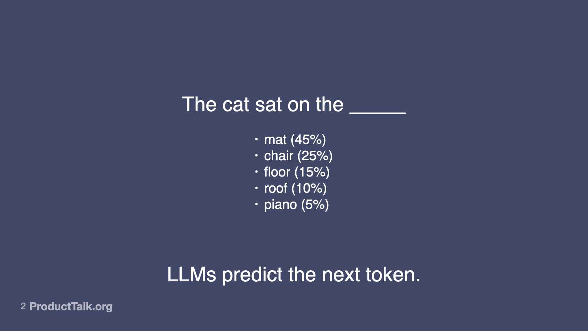
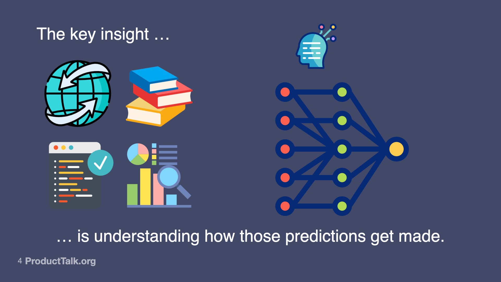
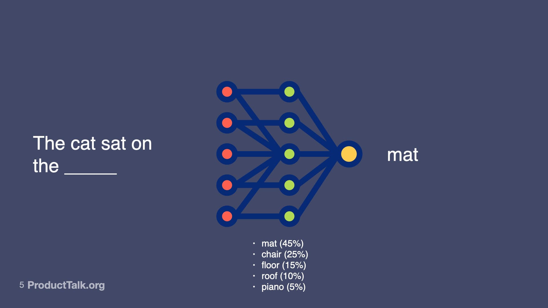
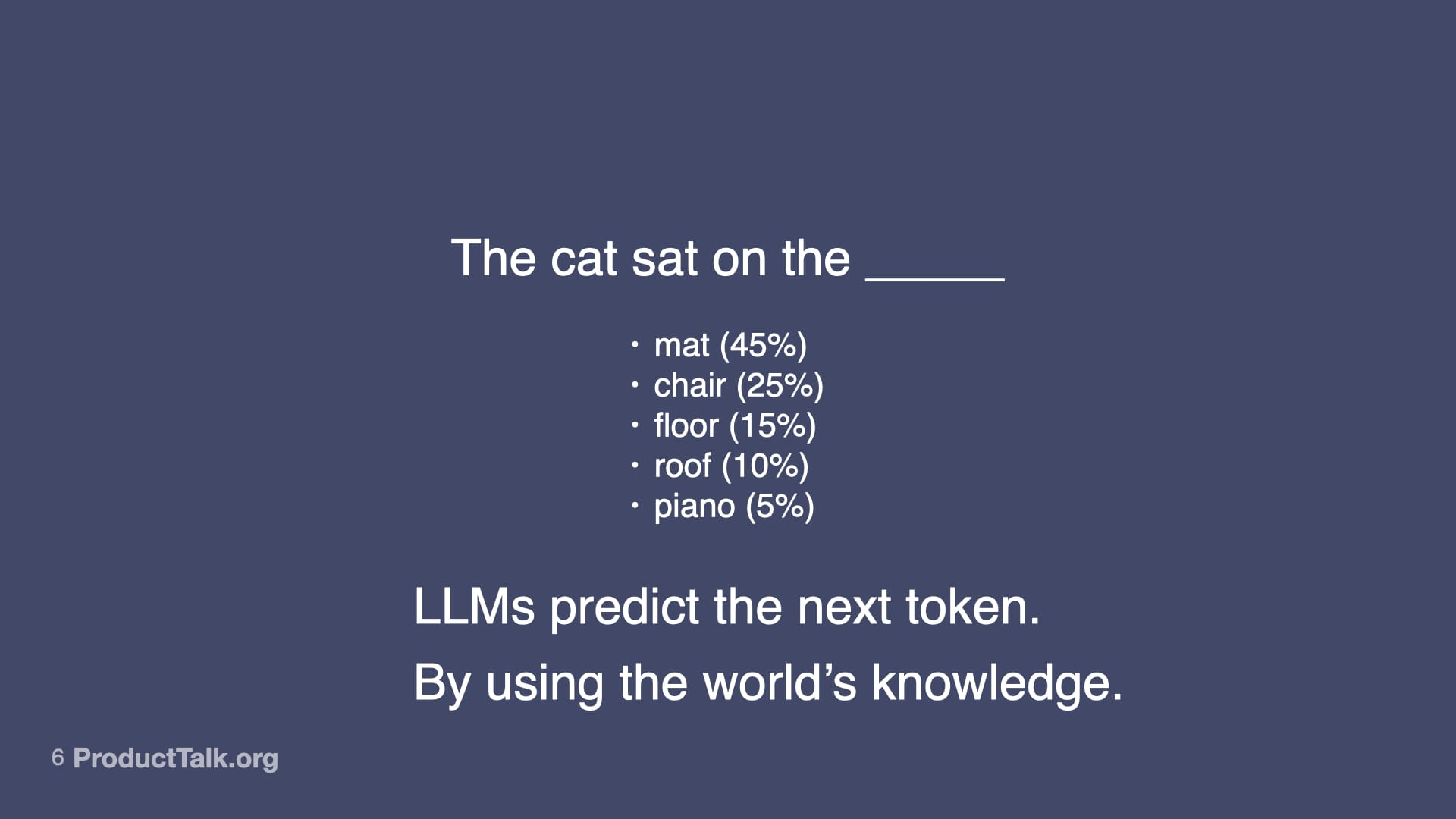
At their core, large language models predict the next token. That’s it. Consider the prompt, “The cat sat on the ____.” Mat is most likely. Chair is pretty likely. Floor, roof, piano—all possible, just less probable. When you give an LLM a prompt, it runs through a neural network—billions of parameters making calculations—to predict the most likely next word, then the next, then the next. That neural net represents not just facts, but relationships, patterns, context—and some might even argue reasoning capabilities—that all influence the probabilities of different outputs. So LLMs don’t just predict the next token. They predict the next token by drawing upon a vast amount of knowledge. LLMs are transformational.
Behind the magic, LLMs don’t “know”—they rank what likely comes next. This slide’s cat sentence with weighted options underscores how generative AI reshapes work while remaining probability-driven.
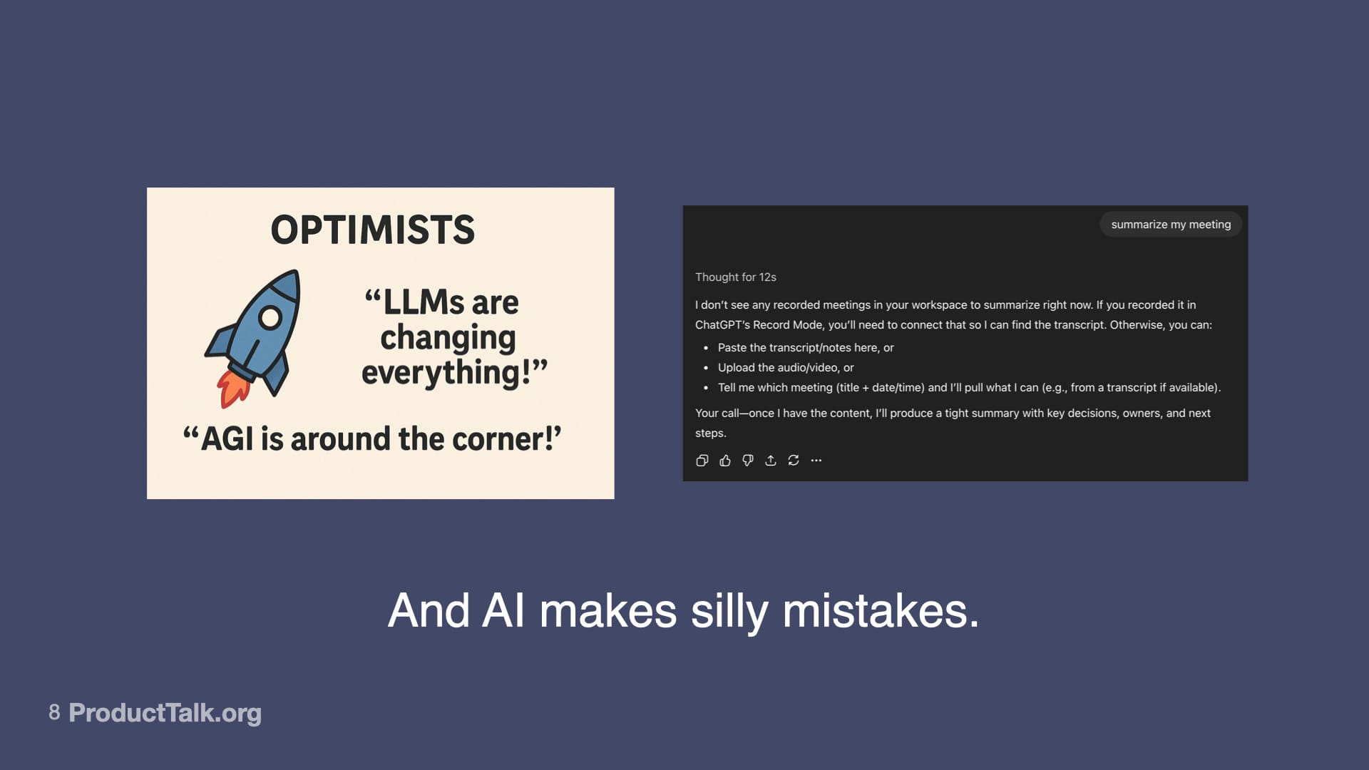
And yet, AI makes silly mistakes. The kind that make you wonder how it could be so smart and so dumb at the same time. No matter how hard I tried, I could not get ChatGPT-5 to fix the closing quote on an image. And it took 12 seconds of thinking to figure out that I asked for a meeting summary but didn’t include any meeting notes. Why do LLMs make these mistakes? Well, it’s because all the LLM is doing is predicting the next token based on patterns. And sometimes those predictions are wrong. And when it’s wrong, it can be confidently wrong. So what do we do?
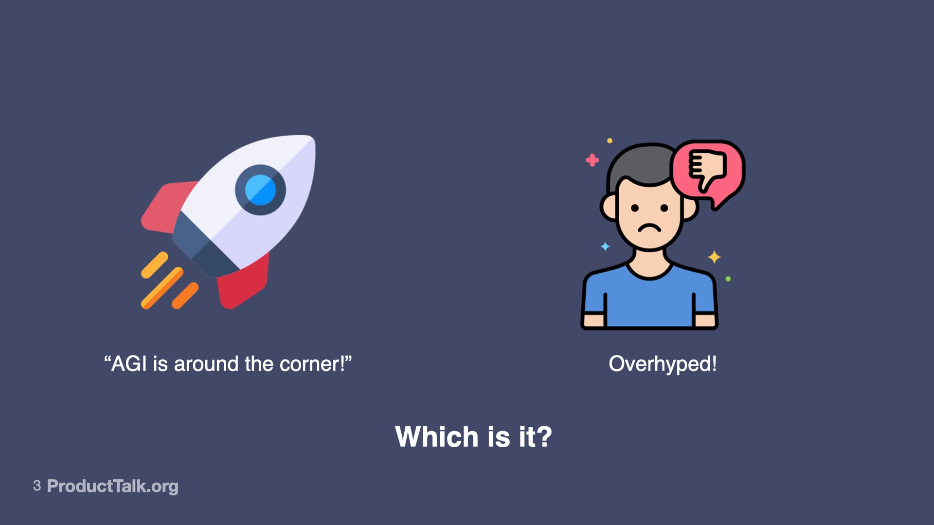
A side-by-side visual pits an optimistic AGI rocket against a frowning skeptic with a thumbs-down, ending with the prompt 'Which is it?'—capturing the debate over whether generative AI is transformative progress or overhyped.
To build reliable AI features, I focus my team on four core skills: prompt engineering, context engineering, orchestration, and evaluation (evals). Together, they let us harness what’s powerful about generative AI while reducing unforced errors.
Generative AI isn’t magic—it’s inputs, training data, and models. This visual invites readers to examine how predictions are produced and why transparency, bias checks, and ethics shape responsible outcomes.
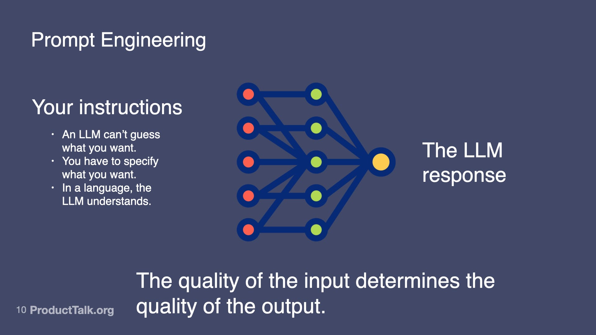
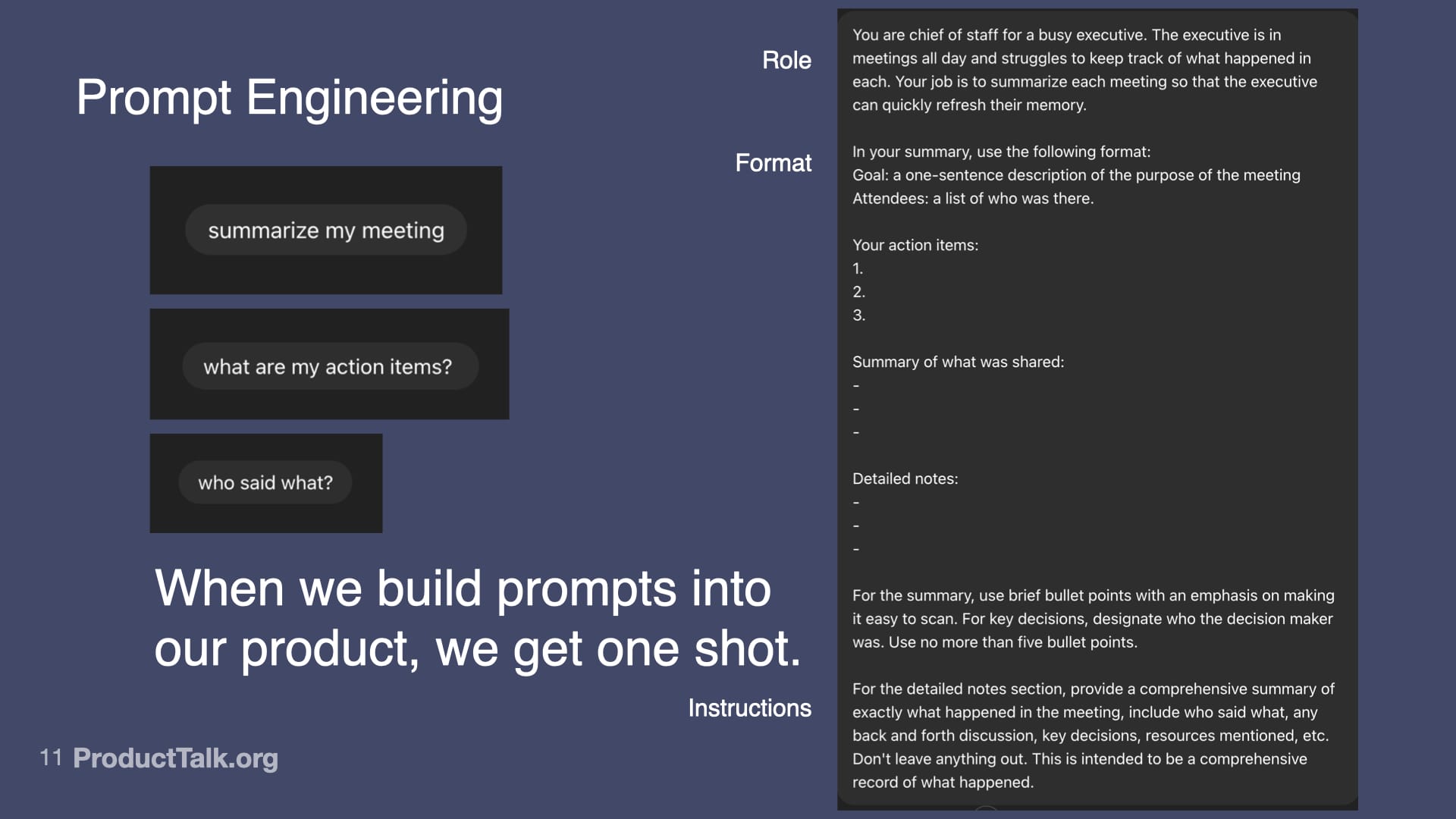
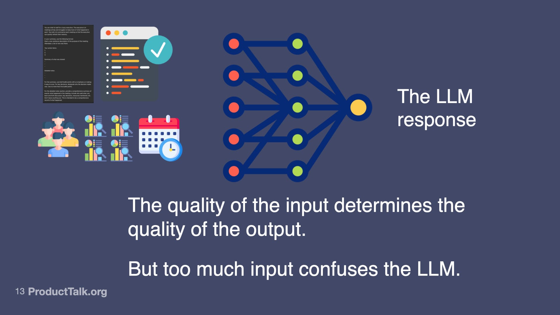
First, prompt engineering. With LLMs, the quality of the input determines the quality of the output. An LLM can’t guess what you want. You have to specify what you want in a language the LLM understands. In a chat, you can iterate with multiple turns. In a product, you get one shot. When we ship a meeting summarizer, for example, I design a production-ready prompt that assigns a role (“You are a chief of staff for a busy executive…”), specifies output format (e.g., a structured list of action items), and clarifies exactly what to include and how to structure it. This is prompt engineering. It’s like writing a really good product spec—but for an AI.
A simple sentence becomes a window into generative AI: a neural network weighs options and selects 'mat,' showing how models rank likely words to produce fluent text—and why outputs feel confident yet probabilistic.
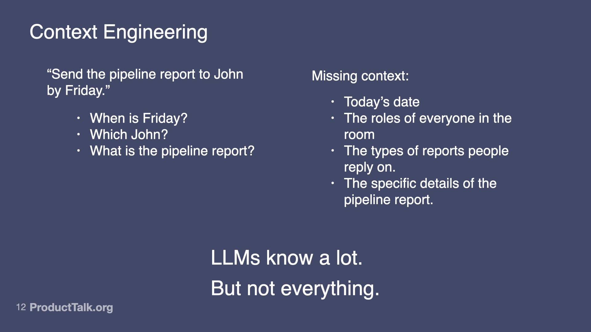
Second, context engineering. LLMs know a lot, but not everything. Imagine a takeaway reads, “Send the pipeline report to John by Friday.” When is Friday? Which John? What is the pipeline report? The model lacks today’s date, the roles of participants, and the specifics of our reporting vocabulary. If you dump every possible detail into the prompt, the model gets noisy input and the quality drops. The key is to add only the context the LLM needs to do the task at hand and nothing more. This is where techniques like RAG (Retrieval Augmented Generation) shine: retrieve just the relevant snippets—e.g., attendee roles, the precise definition of “pipeline report,” and the calendar context for “Friday”—and include only those in the prompt.
A minimalist slide demystifies how LLMs choose words: given 'The cat sat on the ____', the model ranks options by probability, showing that AI outputs are weighted predictions, not facts, which matters for ethics and product decisions.
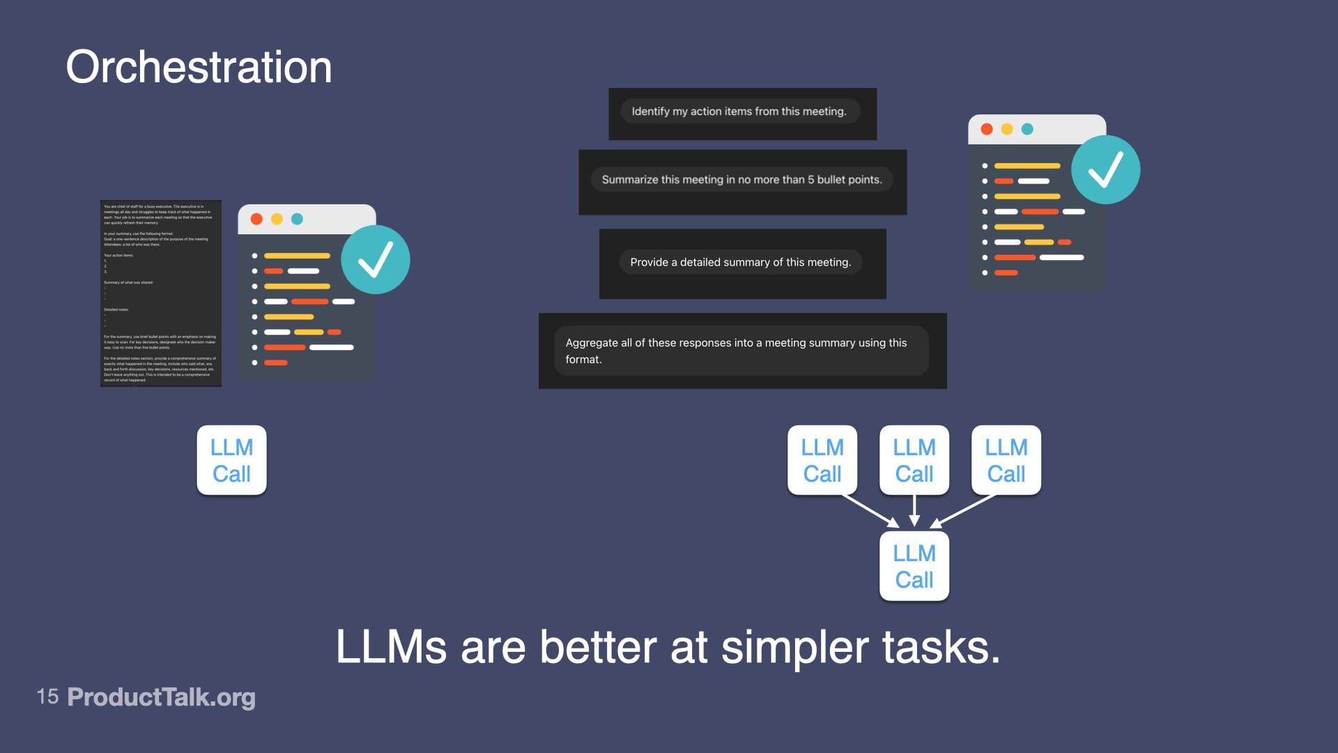
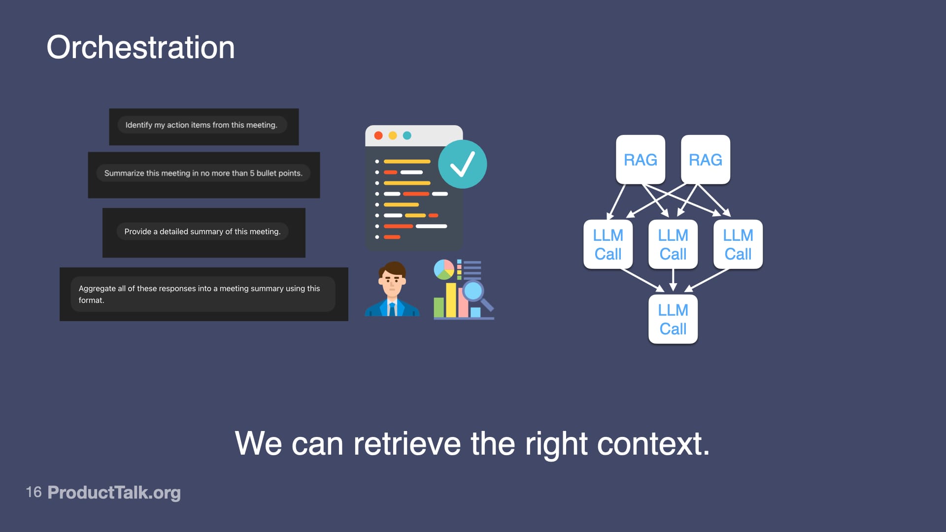
Third, orchestration. LLMs are better at simpler tasks. If you try to do everything in one prompt—identify action items, summarize the meeting, categorize by urgency, match to owners, check for clarity—the quality goes down. But if you break it into steps, each focused on one thing, the quality goes up. I design a workflow of multiple LLM calls that work together. For example: First call: identify action items from the transcript. Second call: categorize by urgency using lightweight project context. Third call: match to owners with a minimal team directory. Fourth call: generate calendar events via an API. Each step is simple. But together, they create something sophisticated.
From building apps by chatting to auto-cleaning video and translating comments, AI compresses complex tasks into simple prompts. This scene shows why it feels transformative—while nudging us to weigh its limits and ethics.
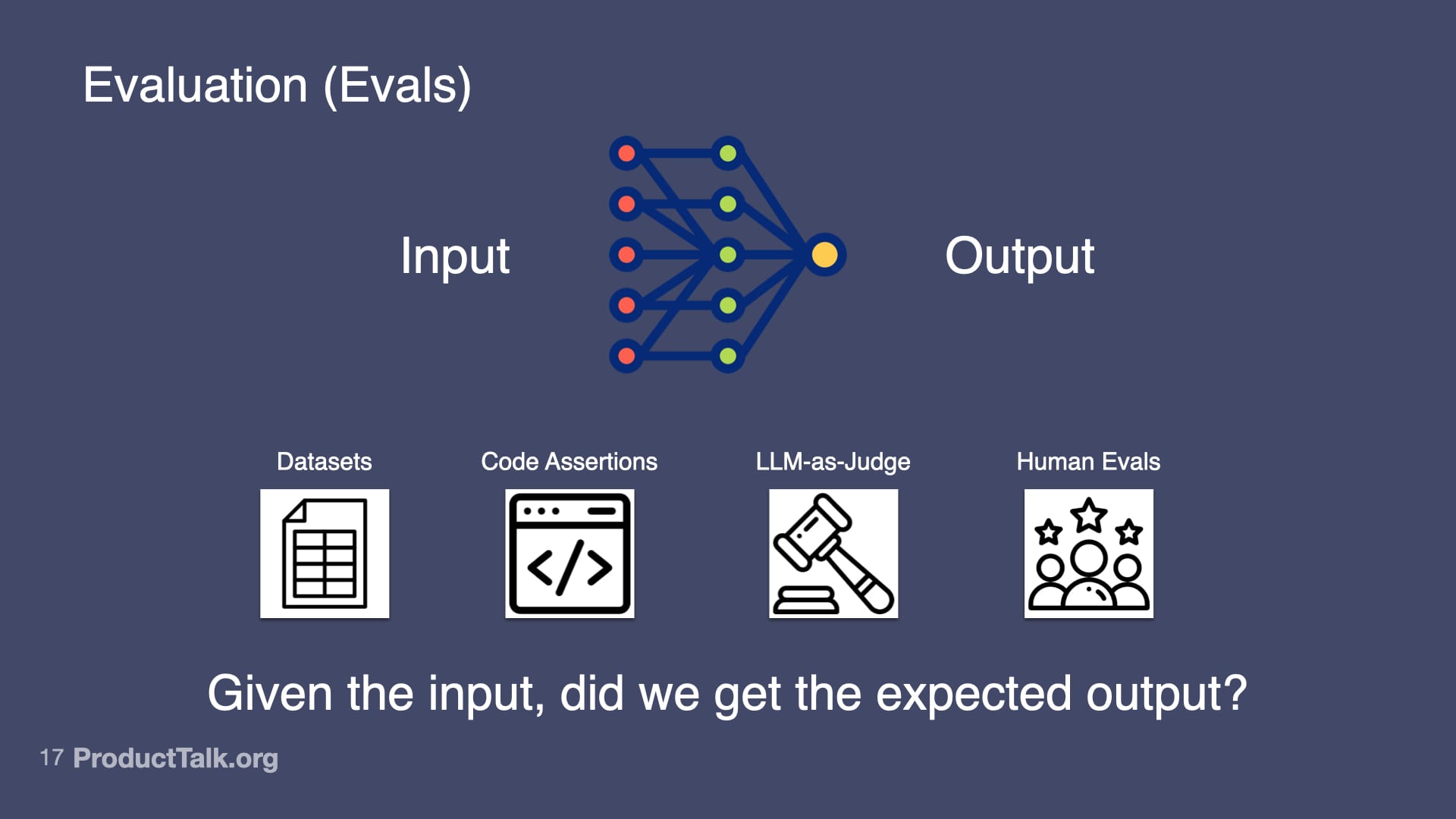
Fourth, evaluation (evals). Otherwise known as: Is my AI product any good? At the heart of evals is this question: Given the input, did we get the expected output? I use several approaches. Datasets: I collect 20–100 real examples, define expected outputs, run the prompt, and measure the success rate. Code assertions: I enforce rules the output must follow (for example, “Every action item must have a task, owner, and deadline”) and fail the test when they’re violated. LLM-as-Judge: I use a model to verify factuality (e.g., “Is each item in this summary in the meeting transcript? Yes or no.”). Human evals: I track whether users need to edit the output and by how much. Start simple; get more sophisticated as the stakes rise.
From “AI Changes Everything (And Nothing At All),” this slide contrasts bold promises with everyday glitches: optimism about LLMs and AGI on the left, and a meeting-summarizer that can’t find content on the right—reminding us AI still errs.
Here’s the hard truth: you can master all four skills and still ship the wrong thing. Why? Because you chose the wrong problem to solve. Who needs yet another meeting summarizer? The ease of building with generative AI tempts us to jump straight to solutions. Resist it.
A keynote slide from AI Changes Everything (And Nothing At All) urges teams to master AI by harnessing its power while minimizing errors, framing a practical, ethical approach to building trustworthy products.
Discovery matters more than ever. Before writing your first prompt, be explicit about the impact you want and set a clear outcome. Talk to your customers and ensure you understand their needs; choose the right opportunity before you chase a cool solution. Explore multiple options and use assumption testing to converge on what will actually move the needle.
Clear prompts shape better AI. This slide shows how explicit, well-structured instructions lead to stronger LLM responses, reminding builders that inputs drive outcomes—and that responsible prompting begins with clarity.
Prototype, test, and build iteratively. With AI products, it’s easy to get to a great demo and hard to get to a production-grade experience. I validated feasibility before I wrote a line of production code by experimenting directly in a model’s UI, pasting real transcripts, and shaping the system instructions and output format. Only after I had a repeatable prompt and useful feedback did I worry about deployment.
Designing prompts is product design. This visual pairs common meeting requests with a rigorous summary framework, reminding teams that when prompts are embedded in products, accuracy matters because you get one shot.
From there, I tested deployment paths with the smallest viable investment. I tried a custom chat in Replit and embedded it. It wasn’t the right interaction model for targeted feedback. I switched to a submission flow using a homework-style pattern: students upload their transcript, the system processes it, they get detailed feedback. Done. That worked—until automation reliability lagged. I wired it up in Zapier, then rebuilt it on AWS Step Function for robust retries and better error handling when scale introduced edge cases.
A reminder that AI needs context: a simple instruction becomes ambiguous without dates, roles, recipients, and report details, highlighting the limits of LLM knowledge and the value of precise, shared prompts.
Each iteration tested a different assumption. Iteration 1 (Claude): Can AI even do this? What makes good feedback? Iteration 2 (Replit chat): How should people interact with it? Iteration 3 (Zapier): Can I integrate this into the existing workflow with minimal engineering? Iteration 4 (Step Functions): How do I make it reliable at scale when things inevitably go wrong? I didn’t know the answers up front; I learned by building, shipping, and observing.
From AI Changes Everything (And Nothing At All), this visual reminds builders that curated, high‑quality prompts yield better LLM responses, while overloaded, noisy inputs derail reasoning and reduce reliability.
Ethical data practices are non-negotiable. Improving AI products requires inspecting traces—the user input, system prompts, tool calls, and LLM responses. For a coaching flow, that includes the uploaded transcript, the system prompts that define evaluation criteria, and the AI’s feedback. To fix issues, I look at traces where things went wrong—but only with explicit user permission. Too many AI products collect everything by default and review traces without clear consent. Don’t do this.
A visual explainer showing how structured inputs—documents, verified code, roles, metrics, and timelines—flow into a network to shape a single, clear LLM response, underscoring the power of context in generative AI.
In my products, users must explicitly grant permission for me to review their data. The consent is clear and specific. If they say no, I don’t see their data. Full stop. That forces me to rely on synthetic data for many tests and to engineer privacy into the architecture from day one rather than bolt it on later. It’s the right thing to do, and increasingly, it’s required.
A visual guide to orchestration: break a complex meeting recap into smaller LLM calls, gather action items, bullet points, and a detailed summary, then aggregate the outputs to boost accuracy and reliability.
Everything changes—and nothing changes. Yes, there are new skills you should master: prompt engineering to get the right output the first time; context engineering to give the LLM exactly what it needs; orchestration to decompose complex tasks into simpler steps; and evals to systematically measure quality. And the fundamentals still rule: solve the right customer problems with strong discovery; prototype and iterate to de-risk; and uphold ethical data practices as a design constraint, not an afterthought. The teams that win with AI will master both the new technical craft and the timeless product fundamentals.
A presentation slide visualizes AI orchestration: user prompts generate meeting summaries while a graph of RAG and LLM calls routes tasks to the best sources, underscoring that retrieving the right context drives better outputs.
If this resonates, pick one active workflow, apply the four AI skills end-to-end, and run a short discovery and eval cycle against a clear outcome. Then ship. You’ll learn faster than any slide deck could ever teach you.
This presentation slide maps how to assess AI: link inputs to outputs with datasets, code assertions, LLM-as-judge checks, and human reviews—centering the question, "Given the input, did we get the expected output?"